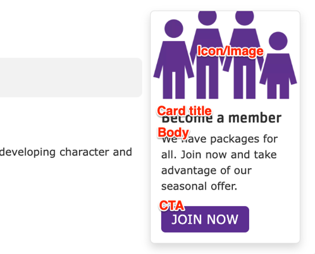
Designs:
- Design System
- Pre-release: Mobile | Desktop
To use the block:
- Click the Layout tab at the top of your page
- Scroll to the location on the page where you want to add a block
- Click Add block
- In the sidebar, click Create custom block
- Choose the block to add.
Fill in the content fields:
- Title (required): This field is for administrative purposes only and is never displayed, regardless of the “Display Title” setting. Use this to easily identify the block in the layout builder.
- Card title: The main title displayed on the promo card.
- Body: A rich text editor for adding the main content of the card.
- Icon/Image: Choose an image from the media library or upload a new one to be displayed above the card text. The format of the image you upload affects how it will be displayed:
- JPG/PNG: Images are cropped to a 3:2 aspect ratio.
- SVG: Images are not cropped, and will retain their original dimensions. Using SVGs is the recommended approach for icons.
- CTA: Configure the link and the text for the call to action button at the bottom of the card.
Then save the block:
- Click Add block in the editing pane.
- Save and publish your changes.
