Partners
Component for displaying logos / info of partners or sponsors within a page using Layout Builder.
Designs:
- Design System
- Pre-release: [Mobile](../../../../../../assets/img/designs/lb/Sponsors Mobile.png) | [Desktop](../../../../../../assets/img/designs/lb/Sponsors Desktop.png)
To use the block:
- Click the Layout tab at the top of your page
- Scroll to the location on the page where you want to add a block
- Click Add block
- In the sidebar, click Create custom block
- Choose the block to add.
Fill in the content fields:
- Title (required): This title is for administrative purposes only and is never displayed, even if “Display Title” is checked.
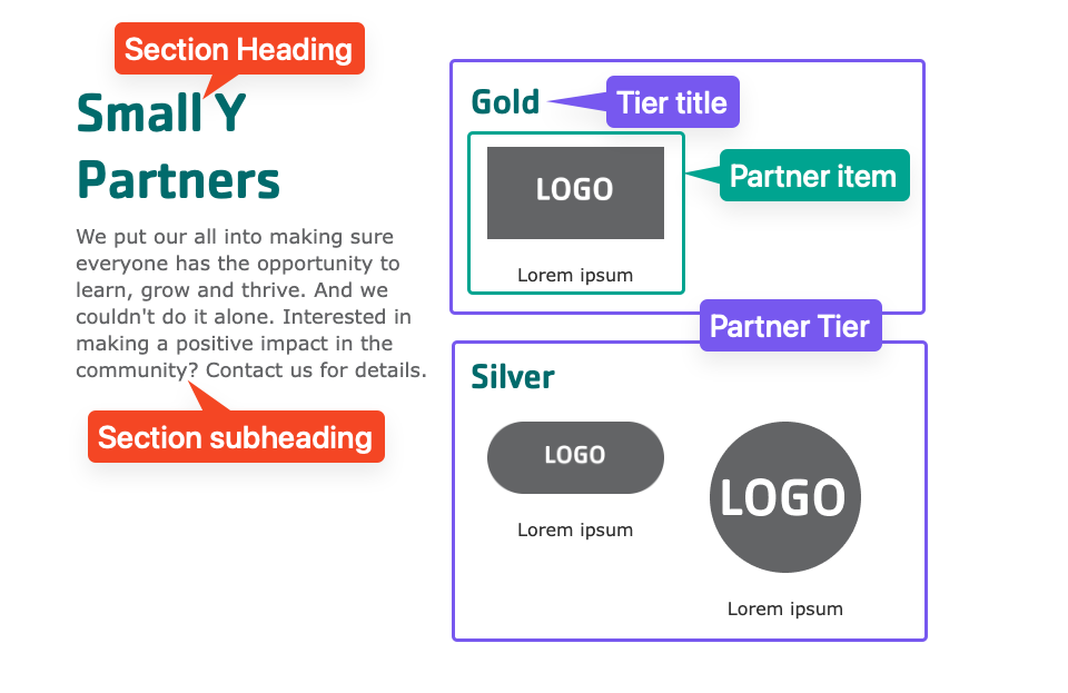
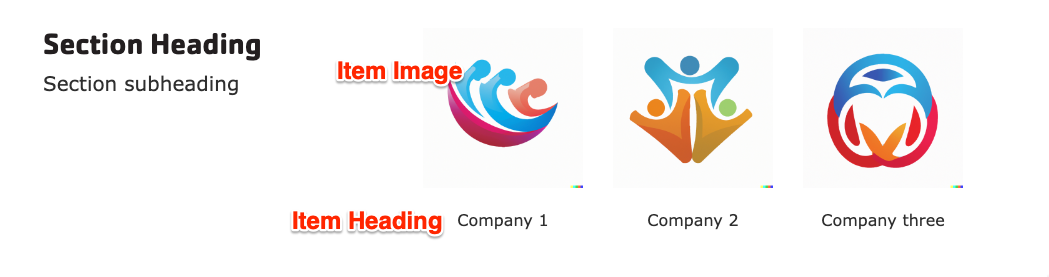
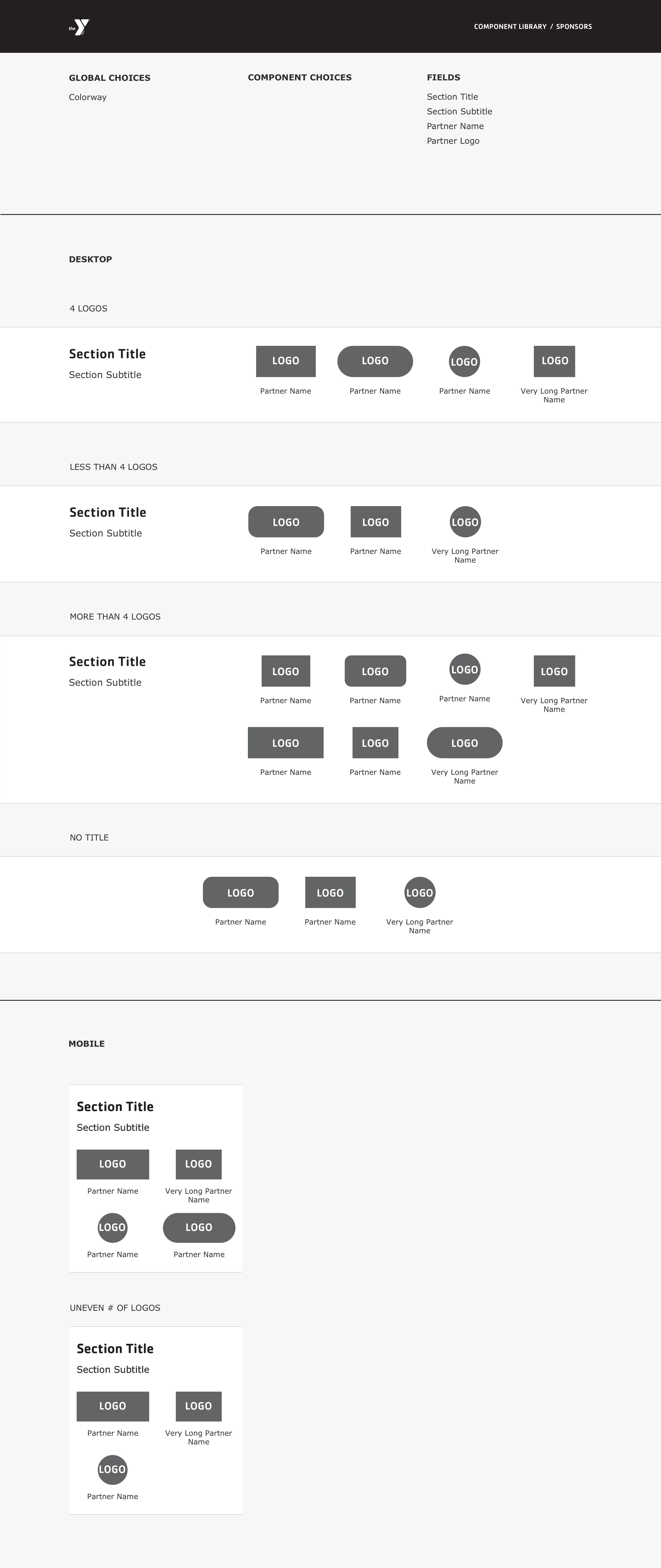
- Section heading: Displayed as a heading above the partner items.
- Section subheading: Displayed below the heading.
- Partner tier: Click Create content block to add a new Partner tier. Add unlimited tiers. (Added in the December 2024 release. Prior to that, all partners were displayed in a single group.)
- Block description: For administrative use only.
- Partner’s Tier: The title of the tier (like “Platinum,” “Gold,” etc.). Leave this empty if you don’t want to display a tier title.
- Partner items: Click Add new custom block to add a new Partner item or Add existing custom block to reuse an existing item. Items can be reused across pages. Add unlimited items. Each item has:
- Heading: The name of the partner.
- Image: The logo or image.
- Link: An internal or external link.
- After filling in the fields for an item, click Create custom block to save the item.
Then save the block:
- Click Add block in the editing pane.
- Save and publish your changes.