Icon Grid
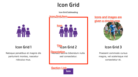
A simpler version of the Grid CTA component. Displays sets of content, each with a title and description, arranged in rows of 2 to 4 items. Icons or images can be included with each item.
The Icon Grid block shares similarities with the
Cards and
Grid CTA blocks but offers a way to display more basic items with a slightly more constrained design. It is based on the lb_icon_grid block content type and uses icon_grid_item paragraphs.
Designs:
To use the block:
- Click the Layout tab at the top of your page
- Scroll to the location on the page where you want to add a block
- Click Add block
- In the sidebar, click Create custom block
- Choose the block to add.
Fill in the content fields:
- Title (required): This field is for administrative purposes only and is never displayed, even if “Display Title” is checked.
- Section heading: Displayed as a heading above the grid items.
- Section subheading: Displayed below the heading.
- Icon Grid section link: A link button displayed below the grid items. This uses the
field_ctafield. - # of columns: Determines the number of columns in the grid, allowing for 2 to 4 columns of items. This uses the
field_icon_columnsfield. - Grid Icon Items: Add up to 4 items to the grid. This is managed by the
field_grid_itemsfield, which referencesicon_grid_itemparagraphs. Each item has the following fields:- Title (required): The title of the grid item. This uses the
field_titlefield. - Description: A full text editor to add content to the grid item. This uses the
field_descriptionfield. - Icon: Choose an existing image from the media library or upload a new image or icon to be displayed above the item text. Circular icons are recommended, and all icons/images will be displayed with a circular crop. This uses the
field_mediafield.
- Title (required): The title of the grid item. This uses the
Then save the block:
- Click Add block in the editing pane.
- Save and publish your changes.
