Carousel
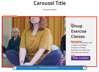
A full-width gallery with multiple sets of a header, description, and call to action overlaid on top of an image.
Designs:
- Design System
- Pre-release: [Mobile](../../../../../../assets/img/designs/lb/Carousels Mobile.png) | [Desktop](../../../../../../assets/img/designs/lb/Carousels Desktop.png)
To use the block:
- Click the Layout tab at the top of your page
- Scroll to the location on the page where you want to add a block
- Click Add block
- In the sidebar, click Create custom block
- Choose the block to add.
Fill in the content fields:
- Title (required): This title is for administrative purposes only and is never displayed, even if “Display Title” is checked.
- Carousel heading: This heading is displayed above the carousel.
- Carousel subheading: This subheading is displayed below the heading.
- Carousel Item: You can add multiple items to the carousel by using the Add Carousel Item or Add new custom block button. Make sure to click Create/Update tab or Create/Update custom block to save each item after adding or editing. Each item includes the following fields:
- Heading
- Image: You can choose an existing image from the media library or upload a new image.
- Description
- Link: This creates a link that appears at the bottom of the carousel item.
Then save the block:
- Click Add block in the editing pane.
- Save and publish your changes.
