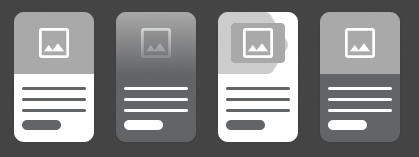
The Cards block is similar to the Grid CTA block, but has more fields and places the image behind the item content.
Designs:
- Design System | Variations
- Pre-release: Mobile | Desktop
To use the block:
- Click the Layout tab at the top of your page
- Scroll to the location on the page where you want to add a block
- Click Add block
- In the sidebar, click Create custom block
- Choose the block to add.
Fill in the content fields:
- Title (required): Never displayed, even if “Display Title” is checked. For administrative use only.
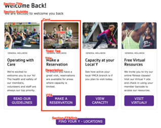
- Section heading: Displayed as a heading above the cards.
- Section subheading: Displayed below the heading.
- Section link: A link button displayed below the list of cards.
- # of columns: Allows 1 to 4 columns of cards.
- Card items: Add up to 4. When you are finished adding or editing each item, be sure to click Create/Update tab or Create/Update custom block to finalize the item. Each card has:
- Heading (required)
- Image: Choose from the library or add a new image to be displayed behind the card text.
- Description: A full text editor to add card content.
- Link: A link at the bottom of the card.
- As of the December 2024 release, Card links can use
link attributes such as
id,target, andclass.
- As of the December 2024 release, Card links can use
link attributes such as
- Topic Tag: This is displayed at the top of the card and can be used to group cards visually.
The Cards block offers several variations that change the look and feel:
- Standard: The default card style.
- Overlay: Places the card content over the image.
- Chevron: Adds a chevron graphic to the image area.
- Color: Applies a background color to the card.
This block comes with multiple styles. To choose an alternative style:
- Click on the Style tab at the top of the Block Add/Update form.
- Expand the Y Style section.
- Choose from the available variations.
- Go back to the Content tab.

Then save the block:
- Click Add block in the editing pane.
- Save and publish your changes.
