These documents are a combination of the former YMCA Website Services Community User Documentation and the User Manual.
If you see something missing or would like to request a new topic, please open an issue.
This is the multi-page printable view of this section. Click here to print.
These documents are a combination of the former YMCA Website Services Community User Documentation and the User Manual.
If you see something missing or would like to request a new topic, please open an issue.
This tool allows you the flexibility to format content however you want within a certain container or area.
Bundled with the Drupal core and the distribution, CKEditor provides a number of different buttons for styling and formatting, as well as a Source editor if you are so inclined to edit HTML directly.
CKEditor has been upgraded to version 5 as of Drupal 10 and is a significant improvement over CKEditor 4. The linking experience is much smoother, uploading images is faster, and it offers a more modern user interface.
The specific toolbar configuration may vary depending on the text format being used (e.g., Basic HTML, Full HTML). Here’s a general overview of available features:
For more info on CKEditor 5, check out these resources (not all features may be implemented in the distribution):
Links are simple in YMCA Website Services. Highlight your text, then click the link icon (🔗) in the editor toolbar, or use the keyboard shortcut Ctrl + K (Windows) or Cmd + K (Mac). In the pop-up window, type or paste your URL into the field and click Save.
Read more and see a demo on the CKEditor website.
The link dialog’s Advanced options let you add attributes to links, including a title (tooltip), id, and CSS classes. You can also configure the link to open in a new browser window or tab.
The Button editor that existed in CKEditor 4 has changed with CKEditor 5 and Drupal 10. Content editors can now add button classes directly through the Advanced Link Options. This allows for more flexible button styling using Bootstrap classes.
To create a button:
Create a regular link in a Layout Builder block or Text Editor.
Open the Advanced options for the link.
In the CSS Classes field, add the desired button classes for Color, Size, and Style (see
Button Classes). Always begin with the btn prefix.
For example: btn btn-primary.
Save the block.
Our distribution combines the default Bootstrap button component with custom styles, as demonstrated at YMCA Lincoln, NE.
btn to establish the base button styles.btn-primary or btn-light.btn-primary style will adopt the selected colorway’s color. Other styles might use non-compliant colors.btn btn-primary.It is recommended to experiment with different styles and verify the button’s appearance before saving the page.
For long landing pages, anchor links (also known as “in-page” links or URI fragments) allow users to jump directly to specific sections.
The process consists of two steps:
An anchor is a point on the page designated with an id attribute in its code. The easiest way to create an anchor is to add a small, hidden link at the beginning of the target section.
#.thank-you or adding-an-anchor).After saving, you can test the anchor by appending #anchor-id to your page URL. For example:
https://ds-docs.y.org/docs/user-documentation/text-editor/adding-links#adding-an-anchor
Entering this URL in your browser should navigate directly to the “Adding an Anchor” section.
To create a link to the anchor:
/docs/user-documentation/text-editor/adding-links./docs/user-documentation/text-editor/adding-links#adding-an-anchor.The internal link should now direct users to the specified location within the page.
Tip: If the anchor doesn’t position the section correctly, or the navigation obscures the linked section, try moving the anchor to the end of the preceding section. This ensures the target section is fully visible.
/ after your domain (e.g., .com, .org). For ymca.org/about, use /about. This improves analytics tracking.https:// (e.g., https://example.org/about).mailto:example@example.org.To update a link, click the linked text, then click the link icon, or use the popup options (in CKEditor 5).
To remove a link, highlight the linked text and click the unlink icon.
Linkit is a community-contributed module that:
provides an autocomplete interface for internal and external linking in rich-text editors. Linkit supports nodes, users, taxonomy terms, files, comments and basic support for all types of entities that define a canonical link template.
Drupal core will soon provide link autocomplete suggestions in CKEditor, similar to Linkit. Until then, developers may want to install and configure Linkit to enhance the linking experience.
Once your site is updated to use CKEditor 5 you will see a new Insert Media button that unifies the processes for embedding Images, Documents, and Videos.
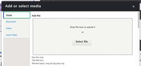
Once your media has been inserted into the field, you can hover over the media to choose from a variety of options.
Displays a Caption area below your image. Once toggled, type your caption below the image.
Allows the media to be linked. See Adding Links for more information.
(for Images only)
Allows you to add alternative text to the media. See WebAIM’s guidelines on Alternative Text for help choosing the right alt text for your image.
Allows you to select the size of the image. Typically you might choose “Full”, “Half”, or “Thumbnail”. Options may vary depending on site configuration.
Choose how to align the media:
Click and drag anywhere on the inserted media to relocate it in the WYSIWYG area.
Use the ⮐ button at the top or bottom of the media to insert a paragraph before or after it.
Click to select the media, then type Delete to remove it.
Choose any of the options for your text below by clicking on the icon or performing the keyboard shortcut indicated. To format text you’ve previously typed, highlight the text and then click on the button in the editor. Many formatting options also have keyboard shortcuts.
Demo Basic Text Formatting on CKEditor 5. or read more detail about these features.
The CKEditor 5 toolbar includes the following text formatting options:
Bold
Italics
Underline
Strikethrough
Superscript
Subscript
Remove Format - Clears all formatting. Useful when pasting content from Word or other applications.
Link - See Adding links.
Bulleted list
Numbered list
Block quote
Insert media - See Adding media.
Insert table - A feature-rich table editor.
Horizontal Line
Heading - Set paragraphs or heading levels—headings in your content should be ordered sequentially for the best accessibility.
Code Block - For inserting multi-line code snippets. Supports syntax highlighting for various languages (Plain text, C, C#, C++, CSS, Diff, HTML, Java, JavaScript, PHP, Python, Ruby, TypeScript, XML).
Source - View or edit the source code of the content. Be aware that some HTML tags may be stripped out due to Drupal’s Text Format rules. Click About text formats below the editor to learn more.
Demo Basic Text Formatting on CKEditor 4 >
Bold Text - Ctrl+B (Windows) or Command (⌘)+B (Mac) or clicking/unclicking the B icon
Italics - Ctrl+I (Windows) or Command (⌘)+I (Mac) or clicking/unclicking the I icon
Underline - Ctrl+U (Windows) or Command (⌘)+U (Mac)or clicking/unclicking the U icon
Strikethrough - Clicking/unclicking the S icon
Alignment controls - Left, Center, Right, and Justify.
Font Color - A small grid of swatches you can apply to your text. Overrides the default font-color
Text Background color (not recommended)
Font (should remain Cachet or Verdana to conform to YMCA brand standards)
Font Size - A dropdown to select the size of your text. Measured in points, not pixels. Overrides the default font size for your text, including styles and format.
Indent - Add one or more indents to your copy. Also, have the option to undo the indent.
Format - A dropdown list of text formats you can apply to your content. Helps to create sections. Comes out-of-the-box with six heading formats.
Most Ys will not use the “Formatted” format, which styles text like HTML code.
Bulleted/Numbered lists - Click the numbered or bulleted list icon to create a list. You can create indented bullets by hitting your tab key or clicking on the indent icon
As an alternative to using the link tool, you can create buttons with YMCA Website Services using the button editor in CKEditor 4. When you click the button icon, a pop-up window will appear.
You can also edit a button you’ve created previously by clicking on the link within the text editor.
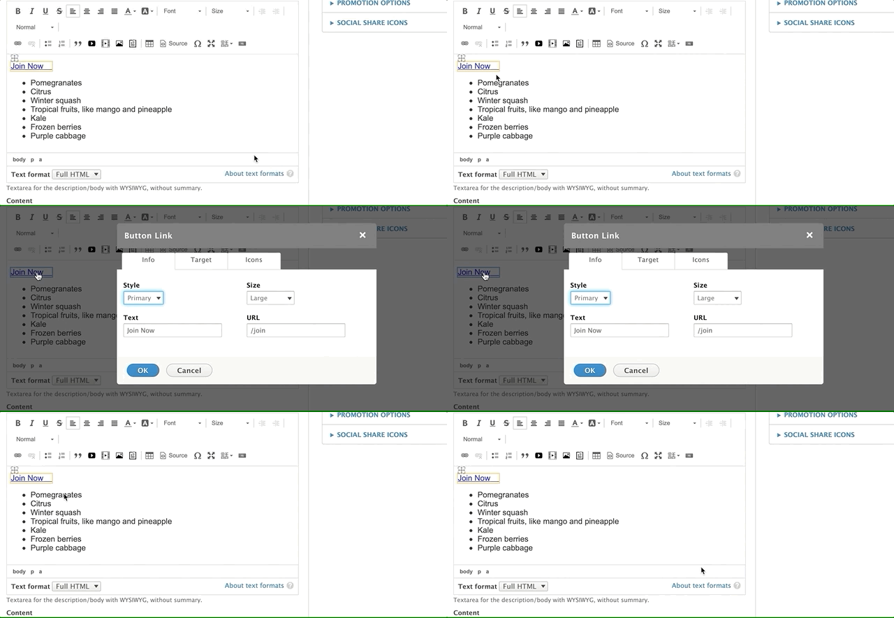
The button editor has three tabs: Info, Target, and Icons.
This tab provides basic styling options for your button or link. The Style Option dropdown menu in the top-left corner allows you to style your button or output it as a plain link.
@mlefler From the YMCA of Lincoln, NE, built this guide to provide examples of possible styles for buttons. Consult your developer or designer for a style guide specific to your YMCA website.
The Size dropdown menu in the top-right corner offers four options for your button size. If you select the “Link” style option, the Size option will not affect your link’s appearance.
Add the text for your link/button in the bottom-left Text field. Enter the destination URL in the URL field on the bottom right.
/ after your domain.example.org/about, enter /about. This is called a relative path and helps with analytics tracking.https://.example.org/about, enter https://example.org/about.mailto: prefix followed by the email address.mailto:example@exampleymca.org.Learn more about absolute vs. relative links.
This tab allows you to control the link’s behavior when clicked. By default, all links have a “Not Set” behavior, which means the link opens in the same tab. The other options include:
» Learn more about link targets
You can add icons to your buttons or links using the Icons tab. Use the Left Icon and Right Icon text fields to integrate icons from the Font Awesome library.
Example: To display a right-facing chevron, type fa-chevron-right in the Right Icon text field.
Browse free Font Awesome icons at fontawesome.com
Note: The left fields reference the Bootstrap Glyphicons library. This icon library has been deprecated, and the Glyphicons fields will not function correctly in YMCA Website Services. These fields will be removed once the code is updated by the tool’s maintainer.
The table editor has been drastically improved in CKEditor 5 and is described in detail in their documentation.
To add a table, click on the table icon in the toolbar. A grid will appear, allowing you to select the desired number of rows and columns.
Alternatively, you can use the dropdown menu to insert a table. This option might offer more advanced configurations and properties directly upon insertion.
To adjust the table’s overall appearance and structure, access the “Table Properties” option. This can usually be found by right-clicking on the table.
The properties dialog typically allows you to configure:
To edit a table after you’ve built one, right-click on the table to bring up a contextual menu with options such as:
You can also double-click inside a table cell to edit its content.
To add a row or column, right-click on the table and navigate to either “Row” or “Column” in the options that appear. You can insert a row or column before or after the current row/column.
Both the row and column options allow you to delete from the right-click menu as well. Just right-click > Row or Column > Delete Row OR Delete Column.
To delete multiple rows or columns, just highlight the rows or columns you want to delete and then right-click and select the delete option.
The “Cell” option from the right-click menu gives you same options as Row and Column, including inserting cells and deleting cells. You can also merge cells or split cells as you would in an excel table by selecting those options from the right-click menu.
The “Cell Properties” option allows you to style your cells. Just right-click > Cell > Cell Properties.
This opens a dialogue box similar to the table properties. You can set the width/height for your cell (pixels only for height; pixels or percentages for your width) in the fields on the left.
Text Wrapping: Choose from a dropdown whether or not to wrap the text in a cell.
Alignment: Use dropdowns to set your vertical and horizontal alignments for your cells.
Colors: Set your border and background colors for your cells. These field support hexadecimal (#FFF) and rgba (256,256,256,1.0) color formats.
Span: Edit your cells to “span” two or more rows or columns. For example, if you have a header cell you want to span two columns, you can set the “Columns Span” field to 2.
If you would like to apply these styling options to multiple cells, just highlight the cells you want to edit and Right-Click > Cell > Cell Properties.
To see an example of what a table might look like on your site, open the “Source” tab on your text editor and insert the HTML. You can then edit the content inside using the WYSIWYG text editor.
<h2>Registration and Pricing</h2>
<table align="left" border="1" cellpadding="5" cellspacing="1" style="width: 500px;">
	<caption>*A $25 deposit is due at the time of registration.</caption>
	<thead>
		<tr>
			<th scope="col">Pricing Period</th>
			<th scope="col">Dates</th>
			<th scope="col">Member Pricing</th>
			<th scope="col">Non-Member Pricing</th>
		</tr>
	</thead>
	<tbody>
		<tr>
			<td>Early Registration</td>
			<td>Feb. 1-29</td>
			<td>$120/week</td>
			<td>$135/week</td>
		</tr>
		<tr>
			<td>Regular Registration</td>
			<td>March 1-May 1</td>
			<td>$130/week</td>
			<td>$150/week</td>
		</tr>
		<tr>
			<td>Late Registration</td>
			<td>May 1-End of Summer</td>
			<td>$150/week</td>
			<td>$175/week</td>
		</tr>
	</tbody>
</table>
<style>
/* To achieve the full effect of this table, insert this style tag above the table or insert it into the CSS Editor module. */
/* margin fix for h6 embedded inside table */
td > h6 {
margin-bottom: 0;
}
/* Fix for mobile table -> issue seems to be related to aggregate CSS file */
.field-answer tr,
.field-answer td,
.paragraph--type--simple-content tr,
.paragraph--type--simple-content td {
display: block !important;
border: none;
}
.field-answer td,
.paragraph--type--simple-content td {
padding: .75rem .31rem;
text-align: left;
vertical-align: middle;
}
.field-answer tr,
.paragraph--type--simple-content tr {
padding: .625rem 0;
}
.field-answer thead,
.paragraph--type--simple-content thead {
display: none;
}
@media (min-width: 992px) {
.field-answer tr,
.paragraph--type--simple-content tr {
display: table-row !important;
}
.field-answer td,
.paragraph--type--simple-content td {
display: table-cell !important;
}
.field-answer thead,
.paragraph--type--simple-content thead {
display: table-header-group;
}
}
</style>
<div class="table-responsive">
<table align="left" cellpadding="10" cellspacing="10" class="w-100 table table-striped">
<thead>
<tr>
<th scope="col">
<h5>Center</h5>
</th>
<th scope="col">
<h5>Address</h5>
</th>
<th scope="col">
<h5>Contact</h5>
</th>
<th scope="col">
<h5>Schedule (PDF)</h5>
</th>
<th scope="col"> </th>
</tr>
</thead>
<tbody>
<tr>
<td>
<h5>Bellevue</h5>
</td>
<td>8101 TN-100<br />
Nashville, TN 37221</td>
<td><a href="tel:615-646-9622">615-646-9622</a></td>
<td>
<p><a href="/sites/default/files/2020-01/dycmp-20-dycmp-pdf-bellevue-menu.pdf"><i class="far fa-file-pdf"> </i>Print Info</a></p>
</td>
<td><strong><a class="btn btn-outline-primary" href="https://operations.daxko.com/Online/4002/ProgramsV2/Search.mvc?program_id=TMP8151&location_ids=B58&category_ids=TAG12062">Register ></a></strong></td>
</tr>
<tr>
<td>
<h5>Brentwood</h5>
</td>
<td>8207 Concord Rd.<br />
Brentwood, TN 37027</td>
<td><a href="tel:615-373-9622">615-373-9622</a></td>
<td><a href="/sites/default/files/2020-01/dycmp-20-dycmp-pdf-brentwood-menu.pdf"><i class="far fa-file-pdf"> </i>Print Info</a></td>
<td><strong><a class="btn btn-outline-primary" href="https://operations.daxko.com/Online/4002/ProgramsV2/Search.mvc?program_id=TMP8151&location_ids=B45&category_ids=TAG12062">Register ></a></strong></td>
</tr>
<tr>
<td>
<h5>Clarksville</h5>
</td>
<td>260 Hillcrest Dr.<br />
Clarksville, TN 37043</td>
<td><a href="tel:931-647-2376">931-647-2376</a></td>
<td><a href="/sites/default/files/2020-01/dycmp-20-dycmp-pdf-clarksville-menu.pdf"><i class="far fa-file-pdf"> </i>Print Info</a></td>
<td><strong><a class="btn btn-outline-primary" href="https://operations.daxko.com/Online/4002/ProgramsV2/Search.mvc?program_id=TMP8151&location_ids=B54&category_ids=TAG12062">Register ></a></strong></td>
</tr>
<tr>
<td>
<h5>Donelson</h5>
</td>
<td>3001 Lebanon Pike<br />
Nashville, TN 37214</td>
<td><a href="tel:615-889-2632">615-889-2632</a></td>
<td><a href="/sites/default/files/2020-01/dycmp-20-dycmp-pdf-donelson-menu.pdf"><i class="far fa-file-pdf"> </i>Print Info</a></td>
<td><strong><a class="btn btn-outline-primary" href="https://operations.daxko.com/Online/4002/ProgramsV2/Search.mvc?program_id=TMP8151&location_ids=B41&category_ids=TAG12062">Register ></a></strong></td>
</tr>
<tr>
<td>
<h5><a>Franklin</a></h5>
</td>
<td>501 S Royal Oaks Blvd.<br />
Franklin, TN 37064</td>
<td><a href="tel:615-591-0322">615-591-0322</a></td>
<td><a href="/sites/default/files/2020-01/dycmp-20-dycmp-pdf-franklin-menu.pdf"><i class="far fa-file-pdf"> </i>Print Info</a></td>
<td><strong><a class="btn btn-outline-primary" href="https://operations.daxko.com/Online/4002/ProgramsV2/Search.mvc?program_id=TMP8151&location_ids=B53&category_ids=TAG12062">Register ></a></strong></td>
</tr>
</tbody>
</table>
YMCA Website Services allows you to upload and embed videos directly into a block of text, either from a supported external source (like YouTube or Vimeo) by pasting the video URL or from the YMCA Website Services media library.
After embedding your video, you may be able to adjust additional options. Note: These options depend on the configuration of your specific YMCA Website Services instance and may not all be available.
Entity Name: This field displays the name of your video.
Display as: This setting controls the size and appearance of the video within your content area. Available options might include:
Link to: This option wraps the video in a link, allowing you to specify a destination URL that users will be directed to when they click on the video.
Align: Use this setting to float the video to the left, right, or center of the page, allowing text to wrap around it.
Caption: Adds a descriptive caption below the video.
When you are satisfied with the video’s settings, click Embed.
If you want to make changes to the video you just embedded after you’ve added it, double click on the video placeholder in the editor, and the “Embed media” dialogue will appear.
YMCA Website Services allows you to upload and embed images directly into a block of text, either from your computer or from the YMCA Website Services media library.
After you save your image to the media library, a dialogue box will appear, giving you some additional options for embedding your image inline.
When you’re ready to embed the image, just click “Embed.” You can also click the back button on the bottom to choose a different image.
If you want to make changes to the image you just embedded after you’ve added it, double click on the icon, and the “Embed media” dialogue will appear.
---
title: 'CKEditor 4: Adding/Embedding Documents'
weight: 99
---


    This document applies to the legacy WYSIWYG editor, CKEditor 4. See


        Adding Media for updated instructions using CKEditor 5.


YMCA Website Services allows you to upload and embed documents directly into a block of text, either from your computer or from the YMCA Website Services media library and browser.

## Adding Documents

*   To add a document, click on the document button (usually represented by a paperclip or document icon) in the text editor toolbar.
*   Make sure you're on the *"Add Document"* or *"Upload"* tab.
*   Next, name your document.
*   Paste the document URL into the appropriate field, or upload the document from your computer.
*   Hit "Save" to proceed.

## Adding Documents from the Media Library

*   To add a document from the media library, click on the document icon in the text editor toolbar.
*   Next, click on the tab that says *"Media Library"* or *"All Documents"*.
*   Select the desired document from the library.
*   Name your document, tag it, and write your alt description as needed.
*   Hit "Save" to proceed.

## Sizing and Floating Your Document

After you save your document to the media library, a dialogue box will appear, giving you some additional options for embedding it inline. These options may vary depending on your specific configuration. Common options include:

*   **Entity Name:** This is simply the name of your document, which you provided earlier.
*   **Display as:** This option allows you to change the size or format of the document display without affecting the original document. By default, YMCA Website Services may offer *Full, Half, and Link* display modes:
    *   **Full:** Your document fills the available area where it's inserted.
    *   **Half:** The document is displayed at half the size of its available area.
    *   **Link:** The document is output as a simple text link to the document file.
*   **Link to:**  This option wraps the document (or the link, if "Display as Link" is selected) in a hyperlink. When users click on the document, they will be directed to the specified URL.
*   **Align:** This allows you to float the document to the left, center, or right of the page.
*   **Caption:** This option adds a descriptive caption below the embedded document or link.

When you're ready to embed the document, click "Embed." You can also click the back button to choose a different document.

> *If you want to make changes to the document you just embedded after you've added it, double click on the icon, and the "Embed media" dialogue will appear. Note that the exact wording of the dialogue box may vary.*
A content type is a reusable container for content, defining its structure and purpose. Utilizing content types supports consistent site architecture and content presentation, helping users efficiently find what they need. In Drupal terminology, content types are entity sub-types for the “Content item” entity type, allowing each content type to have its own fields and display settings.
There are two main categories of Content Types in the YMCA Website Services distribution:
Most sites utilize a combination of these content types. The appropriate content type depends on how the content will be used and displayed. While Landing Pages often constitute the majority of a site’s content, other types like Events, Articles, and Branches may be necessary to achieve specific site goals.
Before building your site, identify the types of content you’ll be creating. A content audit can help you understand your existing content and identify what new content needs to be developed.
Landing Pages are often the starting point for site construction due to their flexibility. They can accommodate a wide range of content.
Location pages, such as Branches and Camps, are also important for promoting individual locations.
Supporting content types like Events and Articles provide timely information to users.
These content types are designed for use with Layout Builder or are compatible with Layout Builder when the supporting module is enabled:
These content types use the legacy Paragraphs page builder:
These content types are not displayed on their own but are used in supporting applications:
The Article content type allows content editors to create various news-related content such as news items, blog posts, and press releases using a single content type. Editors can customize the layout and display of these articles based on their type, enabling them to show news items on a dedicated news page and blog posts on a blog page.
The Article content type also allows content editors to incorporate Layout Builder components directly within the page, providing enhanced control over content presentation.
<div style="position: relative; padding-bottom: 56.25%; height: 0; overflow: hidden;">
<iframe allow="accelerometer; autoplay; clipboard-write; encrypted-media; gyroscope; picture-in-picture; web-share" allowfullscreen="allowfullscreen" loading="eager" referrerpolicy="strict-origin-when-cross-origin" src="https://www.youtube.com/embed/FBtQmfy9C7Q?autoplay=0&controls=1&end=0&loop=0&mute=0&start=0" style="position: absolute; top: 0; left: 0; width: 100%; height: 100%; border:0;" title="YouTube video"></iframe>
</div>
Go to Admin > Content > Add Content > Article (Layout Builder).
Fill in the content fields:
After creating an Article, you can customize its layout using Layout Builder. The following components are designed to work specifically with the Article content type:
Designs:
Go to Admin > Content > Add Content > Event (Layout Builder)
Fill in the content fields:
As of March 2023, this field supports recurring events.
To create a recurring event:
Once you save the event, Manage Instance will allow you to customize or remove individual instances.
To select multiple dates for your event that do not fit a regular rule, use Add another item below the date selector.
Once you create an Event you can customize the layout with Layout Builder. These components are built specifically to work with the Event content type:
Content editors rarely, if ever, enter information directly into these content types on a day-to-day basis. However, it is important to know how they work and how they relate to manually-entered content.
Example - Swim Lessons
- Swimming and Aquatics (Program Page, manually entered)
- Swim Lessons (Program Subcategory Page, manually entered)
- Youth Group Swim Lessons (Activity, mapped from CRM or custom automation)
- Stage 3 (Class, mapped from CRM)
- Monday/Wednesday/Friday 9:30-10 a.m. at Franklin Family YMCA (Session, mapped from CRM)
Note: This is an example only. Depending on your CRM and any customizations you make, your setup for Swim Lessons or any program may look different that the example listed above.
Often used as the top-level filter in Activity Finder and Repeat Schedules, Activity consists of the following fields:
A narrower selection of Program Offerings. Not an individual instance, but a smaller selection of instances.
Classes have three fields that map into Activity Finder and Repeat Schedules: a description, a title, and entity reference/tag to an Activity.
Class also contains Areas for content editors to add paragraphs; however, depending on how your CRM and the number of programs your Y runs, it may not be practical to use these fields.
An individual program offering. Contains fields for pricing, session date/time, instructor, ages, and a registration link. These are the individual rows/instances in Repeat Schedules and Activity Finder.
Unlike most content types in YMCA Website Services, you don’t use Alert to create pages. Instead, Alerts display as a rendered entity or a section of content on other pages.
Alerts also don’t use Paragraphs or Layout Builder. By design, the layout of Alerts is rigid; however, the text editor and the color options listed below allow content editors some flexibility.
Go to Admin > Content > Add Content > Alert (/node/add/alert).
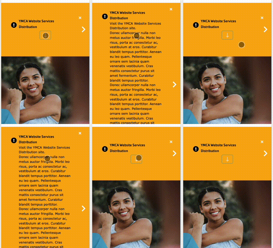
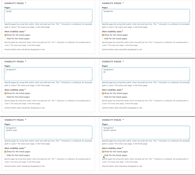
Visibility pages: This is where you control where the alert displays on your site. In the large text field, you write the relative path of the pages where you want this to appear or not appear. Enter each path on a new line. Each path should start with a slash, /.
You also have the option to use an asterisk character * as a wildcard so you don’t have to enter a large number of relative paths. For example, if you wanted to add an alert to a /health-and-fitness section, you would enter /health-and-fitness* in the text area.
What is a relative path?
A relative path is the part of your URL after your domain name.
At
https://example.com/community, for example, the domain name isexample.com, while the relative path is/community.
Using the Alert visibility state radio buttons at the bottom, you can either show or hide your alert from the page paths listed in the text area above.
Location: This field provides additional flexibility for controlling where the Alert will display. Selecting a Location from this field will display the alert on the Location page and any related page (blog posts, news, landing pages) that has the corresponding Location selected.
Alerts can be rearranged to control the order in which they display if multiple appear on a page. The Alerts Rearrange page can be accessed via its link on the Content page or at Admin > Content > Alerts Rearrange (/admin/content/alerts-rearrange). The link might not appear in the Admin menu prior to version 10.3.1.
To rearrange alerts:
Figuring out exactly how to show an alert on the right pages can be a challenge. The Visibility pages, Alert visibility state, and Location selectors work together to control where an alert is displayed. Here are some tips on how to get just what you want.
To show an alert only on a single Location page:
/locations/downtown-ymcaTo show an alert on a location and any related pages:
“Related pages” in this case means any page with a specific location selected in its Location field.
The wildcard * can be used to specify any page in a section of the site.
To show an alert on every page on the site:
*To show an alert on every swimming page:
/programs/swimming*The position of the
*wildcard is important. Consider/programs/swimming*versus/programs/swimming/*:Show for
/programs/swimming*:
- ✅
/programs/swimming- ✅
/programs/swimming/drop-in- ✅
/programs/swimming/swim-lessonsShow for
/programs/swimming/*:
- ❌
/programs/swimming- ✅
/programs/swimming/drop-in- ✅
/programs/swimming/swim-lessons
You can use / OR <front> to show an alert on the home page. <front> is a special token and should always be listed on its own line.
/ OR <front>Sometimes you want to show an alert on all pages except a few. Maybe you have an alert for a fundraising campaign but don’t want to show it on the “Join” or the “Give” page. The Hide for the listed pages option can help in this case.
To show an alert on all pages except “Join” and “Give”:
Visibility pages:
/join
/give
Alert visibility state: “Hide for the listed pages”
Location: “None”
Note: This Content Type is similar to the News Post content type.
Blog posts in YMCA Website Services allow you the flexibility to create simple posts using only the text editor or more robust layouts with paragraphs. Blog posts utilize a two-column layout, with the content area on the left and the sidebar area on the right.
When you decide to use a blog post depends greatly on your Association’s content strategy. However, blog posts are designed for publishing timely content and listing them throughout your site. Examples of blog posts may include:
There are three fields that appear above the accordion tabs:
Title: The name of the blog post. Displays in the header area of your blog post and in the cards that display in a list of blogs.
Locations: An option select field to tag a post with one or more locations (Camp or Branch). Use Ctrl+Click (Windows) or Cmd⌘+Click (Mac) to select multiple locations.
Each time you create a new Branch Page or Camp Page, it automatically populates into the locations field.
Category: An entity reference to the Blog Category vocabulary. Type in the name of the category and select from the options that appear, or create a new category/term by typing in a new one.

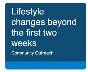
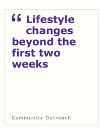
This dropdown changes the style of the post’s card when it appears in a listing format. This dropdown does not affect any layouts on the page itself.
| Carnation | Lily |
|---|---|
 |  |
| Carnation | Lily |
|---|---|
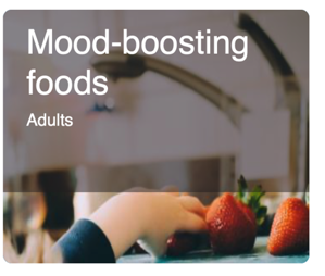 | 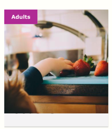 |
When choosing the Color Card style, you are presented with two styling options in dropdowns. Both are entity references to the Color vocabulary:
| Carnation | Lily |
|---|---|
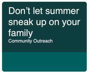 | 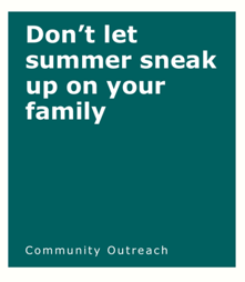 |
The content area is the main body of your page. You can use the default fields or build a more robust layout using paragraphs. The content area displays on the left side of the page.
Image: Displays above your description and inside a Photo Card. This field is optional. It uses the media browser and image field.
Description: You can enter a brief summary or the entire body of your text by using the text editor.
The sidebar area allows you to embed paragraphs below a section that links to the centers tagged in the post, the categories, and a Related Content field. The Related Content field allows you to promote other Blog Posts by tagging them with the autocomplete widget. The sidebar area displays on the right side of the page.
Blog posts utilize a two-column layout. The Content Area displays on the left, while the Sidebar Area displays on the right. You can build layouts within these areas using paragraphs.
Branch pages contain multiple data fields that work together to help members find the right location, hours, and amenities that fit their needs.
Designs:
Branch Page - Design System
Branch Amenities - Design System
Branch Hours - Design System
Branch Menu - Design System
Branch Preferred Branch - Design System
Branch Social Links - Design System
Go to Admin > Content > Add Content > Branch
Fill in the content fields:

Address: The physical address of your location. Be sure to include all address fields.
Branch Coordinates (required): This field pins your branch on the locations map.
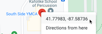
lat, long into one of the fields, then cut and paste to separate them.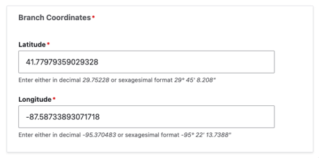
Phone (required): The main phone line for your branch. Will be displayed as it is entered and linked to allow mobile users to tap to call.
Fax: Optional.
Email: We recommend you use a main contact email, such as info@example.com, rather than the email for an individual staff member.
Directions: By default, a link with directions is auto-generated using the Address field. Use this field to substitute your own directions link.
Add the main hours for your facility. These are displayed in the header and on the Locations page.
<open time> <separator> <end time> should work, but we recommend something like 7am-5pmThis section is not displayed when “Use Layout Builder” is selected.
There is no image field for the Branch content type, so you will need to add one of the following paragraphs to add an image and title at the top of your page:
This section is not displayed when “Use Layout Builder” is selected.
The Branch Content Type only has one layout option—one column—and no description field. Paragraphs will form the body of the page.
The following paragraph types integrate directly with Branch pages:
This section is not displayed when “Use Layout Builder” is selected.
Use the bottom area for anchoring elements on your page. The following paragraphs are great for this area:
Type in and select which amenities are available or not available at your branch using the autocomplete field.
If you embed a Branch Amenities with the Icons paragraph or Branch Amenities block on your page, the amenities will be displayed in your content. The Amenities will also serve as filters for branches on your locations page.
If you don’t see an option available or would like to rename a branch amenity, go to Structure > Taxonomy > Amenities. See Taxonomy for more info.
The Branch Menu is a single-level sub-menu that displays within a branch page (and sub-pages) that allows users to drill down to additional content specific to that branch. The Branch Menu always shows “Branch Home” as its first link.
Beginning in Website Services 9.2.13 content editors have the option of customizing the Branch page with Layout Builder. You can migrate from using Paragraphs to using Layout Builder on a branch-by-branch basis to ease the transition.
The Use Layout Builder checkbox on the Branch edit page non-destructively switches between Paragraphs and Layout Builder. If the checkbox does not appear, ensure the Y Branch (y_branch) module is installed at Admin > Extend (/admin/modules).
Branch pages have several specialized components that utilize the structured data (fields) that already exist on your branch page in newly designed Layout Builder Blocks.
In addition to using many of the standard Layout Builder components, Branch pages also use several components that display the fields described above.
These blocks are available via All system blocks in Layout Builder:
One additional component is available that requires additional information:
Designs:
This component allows you to place up to 6 social media links on a branch page.
This feature allows users to select a single branch location as their home / preferred branch so that they can easily access branch-specific content across the site.
The Home Branch selector popup will appear to users who arrive at the site and:
Users can select a Home Branch by:
Users can remove a Home Branch by:
Selecting a home branch will:
If you want to completely remove the Home Branch selector from your site you will need to disable it via the command line. DO NOT disable the module via the admin UI as this will result in an error.
drush pmu ws_home_branch openy_home_branch
Migrating Branches to Layout Builder involves recreating some content on the page. The process is similar to building a new Landing Page with Layout Builder but with a lot of the work done for you!
Once you are ready to migrate a Branch:
The Camp content type is used for physical locations where outdoor camp programming takes place.
While YMCA Branches may offer some form of summer day camp, they differ from facilities that primarily host programs related to outdoor camps. The Camp content type also enables editors to create sub-sites or “microsites” using a separate menu structure.
Designs:
If you are an independent YMCA camp or you’re an Association with one or more locations dedicated to outdoor camp, the Camp Content Type serves well as a landing page for those locations. Camp teasers will also appear on the Location Finder page.
There are several considerations for Branches that host Day Camps in the center:
- The Branch content type is intended to be the home page for branches.
- Adding a Branch listing and a Camp listing for the same physical location creates duplicate listings for your center and could have search implications.
- Camp pages don’t have fields for operating hours or amenities.
- Branch Day Camps, unlike outdoor camps, tend to be listed in the same CRM as other branch-based programs and therefore could integrate into Activity Finder, provided the CRM’s compatibility.
Recommended Content Types for Branch Day Camps
Title (required): This is the name of your camp, which will display as your page title and the title in the location card.
Menu Links (required): Add in the URL or name of the content you want to link your Camp Menu to (you must use the Camp Menu paragraph for this to work). This field is not used with Layout Builder.
info@example.com, rather than the email for an individual staff member.There is no image field for the Camp content type, so you will need to add one of the following paragraphs to add an image and title at the top of your page:
Below your header image, add in a Camp Menu paragraph for a secondary, full-width navigation.
The Camp Content Type only has one layout option—one column—and no description field. Add in almost any paragraph you want into the body of you page.
The following paragraph types integrate directly with Camp:
You can also associate blogs with your camp.
Use the bottom area for anchoring elements on your page. The following paragraphs are great for this area:
Beginning in Website Services 9.3, content editors have the option of customizing the Camp page with Layout Builder. You can migrate from using Paragraphs to using Layout Builder on a camp-by-camp basis to ease the transition.
The Use Layout Builder checkbox on the Camp edit page non-destructively switches between Paragraphs and Layout Builder. If the checkbox does not appear, ensure the Y Camp (y_camp) module is installed at Admin > Extend (/admin/modules).
The Camp page is often used as a landing page for a microsite with additional information, such as schedules, packing lists, and other camp-specific pages.
We have two camp-specific menus that help build this structure:
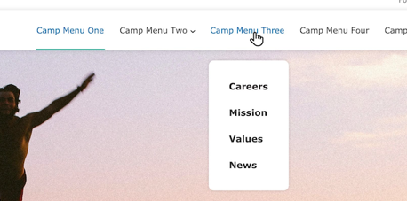
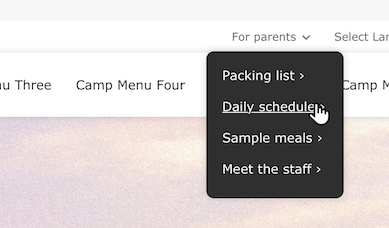
After enabling Use Layout Builder for your Camp page, navigate to the Layout tab. You need to configure the Camp Quick Links in two blocks for them to properly display on desktop and tablet/mobile devices.
In the Configure Camp Header section, you will see placeholders for each of the menu blocks that say Please select the menu to display in this Camp Quick Links block.
Using the on the first Camp Quick Links block, click Configure.
In this menu, you can create a new menu or add an existing one that you’ve made in the Menus administration (/admin/structure/menu). To create a new menu, fill in these fields:
Title (required): The title of the Quick Links menu to be displayed in the Utility Navigation.
Display title: Must be checked in order for the Quick links to display properly.
Click Add new menu, then set up the new menu:
Camp Coleman Quick Links.camp-coleman-quick-links.Click Create menu, then click Edit links to add items to the menu.
In the Edit links popup you can add and reorder links in the menu.
When you are finished adding and rearranging menu links, click Save.
Finally, save all the changes with Update.
Find the second place that says Please select the menu to display in this Camp Quick Links block in the Header Section.
Using the on this block, click Configure.
As before, configure the block:
Once the existing menu has been added, you will see the Edit, Remove, and Edit Links options. Once you see those, you can click Update to save these changes.
Once you have completed the process you will see your Quick Links menu displayed in two sections of the Header. This will ensure that the menu is displayed properly across all displays.
... Camp Menu ...The Camp Subpage (formerly “Camp Landing Page”) content type allows you to create internal pages for your camp section or microsite. Once you’ve created the parent Camp page, you are ready to create additional Camp Subpage pages.
Go to Content > Add Content > Camp Subpage.
Set the Title.
In the Camp field, begin typing the name of the Camp page that will be the parent page, then select the item from the autocomplete dropdown.
Click Save and edit layout.
You will now see the Layout Builder editor with the menus from your Camp page pre-populated in the layout.
Add additional content using Layout Builder, then click Save layout.
Note: The menu references on Camp Subpages are copied to the header when the page is created. Any updates to those menus (new items, reordering) will be reflected on all subpages. However, later changes to the blocks (removing the menu altogether, changing the linked menu) will need to be made on both Camp and Camp Subpage pages separately.
Camp Subpages are not automatically added to the Camp Menu of their corresponding Camp. Be sure to add the newly created Camp Subpage to the Camp Menu so that it’s properly linked.
Camp pages have a number of specialized components that utilize the structured data (fields) that already exist on your camp page in newly designed Layout Builder Blocks.
In addition to using many of the standard Layout Builder components, Camp pages also use a number of components that display fields described above.
The Camp Info Block is automatically added to the Body section of each Camp page. It displays content from the Contact Info section. It can be rearranged on the page but is not otherwise configurable.
When you create a new Camp page or switch an existing one to use Layout Builder, it will come with a pre-set Camp Header Section, which enables the configuration steps above. If you find some of those blocks are missing, you can restore them manually.
To completely start over, use the x to the left of Configure Camp Header to delete the section. Add a new Section and choose the WS Camp Header layout. Then, add the following blocks by selecting Add block in the corresponding region.
The default configuration for a the Camp Header block should be:
Utility Menu
Main Menu
The Camp content type uses the following URL pattern: /camps/[node:title]
The Facility content type is used for locations where programming might take place that are not a full YMCA Branch. This might be a childcare facility, a shared-use space, or an office.
Designs:
Facilities share their design with the Branch content type.
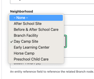
10.3.1, December 2023.)info@example.com, rather than the email for an individual staff member.10.3.1, December 2023.)For aside pieces of content, such as side navigations, promotional cards, and content related to the main part of your page. Use the Paragraphs described below to add content to this area only if “Use Layout Builder” is not selected.
These sections are not displayed when “Use Layout Builder” is selected.
Use Paragraphs to add content to your Facility page.
Beginning in Website Services 10.3.0 content editors have the option of customizing the Facility page with Layout Builder. You can migrate from using Paragraphs to using Layout Builder on a facility-by-facility basis in order to ease the transition.
The Use Layout Builder checkbox on the Facility edit page non-destructively switches between Paragraphs and Layout Builder. If the checkbox does not appear, ensure the Y Facility (y_facility) module is installed at Admin > Extend (/admin/modules). This module provides the necessary integration with Layout Builder.
The migration process is identical to Migrating Branches to Layout Builder.
This is what you will see in your admin portal as your content’s name. It will also show as the page title in the Header unless you add a paragraph in the Header Area. The title will appear in the <title> tag of the HTML, which is important for SEO and accessibility.
Landing Pages come with four basic layouts for desktop. For mobile, all layouts display in a single column, with the Sidebar Area stacking below the Content Area.
You can use any number of Paragraphs in these fields. Paragraphs are reusable content components that can be added to various areas of your landing page.
This page is the base for building pages with Layout Builder.
Go to Admin > Content > Add Content > Landing Page (Layout Builder).
Fill in the content fields:
Title (required): The title of the page. This is for internal use, such as in the admin content list. It will not be displayed on the page itself unless you add it manually with a block in the Banner section.
Metadata: This content is used to provide context to search engines and page previews. For the best user experience:
Create clickable titles.
Write a compelling description.
Add a descriptive image.
Meta description: A brief and concise summary of the page’s content, with a recommended maximum length of 160 characters.
Meta image: Choose or upload an image to be used as a thumbnail for social sharing and preview cards.
Meta tags: Advanced meta tag configuration. Caution: This section should not be edited unless you are familiar with meta tags and their impact on SEO.
Once you create a Landing Page, you can customize its layout and content using Layout Builder.
Landing Pages come with these pre-configured sections:
Header: Typically contains the site logo, site name, and navigation menus.
Banner: An edge-to-edge section, without margins (gutters), that is designed for visual impact. It works best with a single Banner or Carousel block.
Body: A section with left and right margins, designed to contain the bulk of your page content.
Footer: Generally includes copyright information, social media links, and secondary navigation menus.
You can edit, reorder, or remove these sections to configure your page as desired. For specialized content, such as digital displays or embedded systems, you can even remove the header and footer altogether.
Blocks are boxes of content rendered into a region of a web page. Blocks are placed and configured specifically for each theme. Blocks can contain a variety of content types, including text, images, menus, and forms.
Content blocks are blocks whose content you can edit. You can define one or more block types, and attach fields to each block type. Content blocks can be placed just like blocks provided by other modules.
The block description is an identification name for a block, which is shown in the administrative interface. It is not displayed on the site. The block title is the heading that is optionally shown to site visitors when the block is placed in a region.
The Membership Info section lists detailed membership information per location. Add one “Membership Info” section for each location that your membership applies to. If a location does not offer a membership type, you can leave it out.
Every membership management system will have different ways of linking in for members to complete their registration. Here are a few we know about. If you have tips for a MMS not listed here, feel free to leave them in the comments.
Navigate to: Membership > Membership Types > Edit > Online Settings. This provides the deep link to the specific membership types.
Note: This Content Type is similar to the Blog Post content type.
News posts in YMCA Website Services allow you the flexibility to create simple posts using only the text editor and more robust layouts with paragraphs.
When you decide to use a news post depends greatly on your Association’s content strategy. However, news posts are designed so you can post timely content and list them throughout your site. Examples of news posts may include:

There are three fields that appear above the accordion tabs:
Title: The name of the news post. Displays in the header area on your news post and in a list view of news posts.
Locations: An option select for you to tag a post with one or more locations (Camp or Branch). Use Ctrl+Click (Windows) or Cmd⌘+Click (Mac) to select multiple locations.
Each time you create a new Branch Page or Camp Page, that location’s name populates into the locations field automatically.
Category: An entity reference to the News Category vocabulary. Type in the name of the category and select from the options that appear, or create a new category/term by typing in a new one.
The content area is the main body of your page. You can use the default fields entered below for a simple block post or build a more robust layout using paragraphs.
The sidebar area also allows you to embed paragraphs below a section that links to the centers tagged in the post, the categories, and a Related Content field that allows you to promote other News Posts by tagging them with the autocomplete widget.
While you have the option to build layouts in news posts using paragraphs, all news posts are strictly two-column layouts. The Content Area displays on the left while the Sidebar Area displays on the right.
In the right column, ensure the “promoted to front page” item is checked, so it will appear in any listings.
The Program content type is a high-level page that directs people to more specific program offerings.
An example of a Program in YMCA Website Services would be a Swimming & Aquatics page that directs people to more specific offerings, such as swim lessons or clinics.
Programs are pages that should link to more specific offering pages. Most often in YMCA Website Services sites, they are the main program pages in an YMCA Website Services mega menu setup.
Description: Displays above the main body of your content and serves as a tease for your Program page when it’s displayed as part of a list on another page. Minimal styling and short lengths are recommended.
Content: The main body of your content. Use paragraphs to build your page layout. Designed to integrate with the Categories Listing paragraph, but that is not required.
For aside pieces of content, such as side navigations, promotional cards and content related to the main part of your page.
Similar to landing pages, Program pages are designed for flexible layouts, with a couple key differences:
Program pages are designed for integration with the Categories Listing paragraph type. Program subcategory pages are tagged with a Program, and those subcategories are displayed as long cards on that Program page.
There is no layout dropdown. How your content displays depends on your theme.
Beginning in Website Services 10.3.1.1 content editors have the option of customizing the Program page with Layout Builder. You can migrate from using Paragraphs to using Layout Builder on a program-by-program basis to ease the transition.
The Use Layout Builder checkbox on the Program edit page non-destructively switches between Paragraphs and Layout Builder. If the checkbox does not appear, ensure the Y Program (y_program) module is installed at Admin > Extend (/admin/modules).
Program pages can take advantage of the Categories Listing block to list child Program Subcategory pages. To add the block:
NOTE: As of version 10.3.1.1 (December 2023) the Categories Listing block styles have not been updated to be in line with the Design System. They will be updated as of the March 2024 release. Keep an eye on y_program releases for details.
Migrating Program pages to Layout Builder uses the same process as building a new Landing Page. See How to migrate to Layout Builder for information about preparing for the migration.
A subset of a Program, Program Subcategory pages list different types of program offerings, which can be grouped into Activities.
Whereas a Program page would describe a Y’s Health & Fitness offerings in general, a Program Subcategory would break that down into subcategories such as:
Most Ys have opted to use Program pages as the top-level categories in their Programs mega menu. Subcategories are then the items underneath each category.
Subcategories also appear as horizontal cards on Program pages.
Learn about the Categories Listing Paragraph ⇒
Start by adding a Title for your Program Subcategory and tag it with a Program.

The Program tag will pull your Program Subcategory in as a horizontal card on a Program page. You can only tag a Subcategory with one Program.
Image: Select an image from the media browser using the image field. It displays in the header and as a thumbnail in Categories Listing.
Color: Use the dropdown to select a background color for your header.
Note: The background color does not display on desktop in Carnation unless you do not have an image selected.
You have the option to add paragraphs in the Header Area. However, these paragraphs display below the image and title you enter above.
For example, if you add a banner in the Header Area, it will display below the title and image entered in those Header Area fields.
Subcategory was originally designed to work with the Classes Listing Filters paragraph in the Header Area and the Classes Listing paragraph in the Content Area.
With the integration of Activity Finder into YMCA Website Services, Classes Listing and Classes Listing Filters are becoming less popular among YMCA Website Services sites.
The Content Area includes a Description that displays full-width just below the Header Area.
When your Subcategory is showed in a Categories Listing on a Program page, the Description is the text inside the card.
You can embed content inside the Content Area, all of which will display below the Description.
The Sidebar Area will change the layout of the page into two columns once you enter content.
Use the Bottom Area for anchoring elements, such as small banners and webforms.
Beginning in Website Services 10.3.1.1 content editors have the option of customizing the Program Subcategory page with Layout Builder. You can migrate from using Paragraphs to using Layout Builder on a program-by-program basis to ease the transition.
The Use Layout Builder checkbox on the Program Subcategory edit page non-destructively switches between Paragraphs and Layout Builder. If the checkbox does not appear, ensure the Y Program Subcategory (y_program_subcategory) module is installed at Admin > Extend (/admin/modules).
Program Subcategory pages do not utilize any specialized blocks. See Layout Builder for the list of all components.
Migrating Program pages to Layout Builder uses the same process as building a new Landing Page. See How to migrate to Layout Builder for information about preparing for the migration.
Promotions are timed pieces of content that allow content editors the flexibility to create a single item that can be placed in multiple locations on the site, without having to duplicate or manage content in multiple locations.
<iframe width="560" height="315" src="https://www.youtube-nocookie.com/embed/hrFHguHoDNE?si=WN-h6H3QuYRQYMgA&start=218" title="YouTube video player" frameborder="0" allow="accelerometer; autoplay; clipboard-write; encrypted-media; gyroscope; picture-in-picture; web-share" referrerpolicy="strict-origin-when-cross-origin" allowfullscreen></iframe>
Version 1 of the Promotion functionality was released in version 10.3.1.1 (December 2023). This version supports swapping promos into:
ws_promotion_activity_finder module.ws_promotion_cards module.ws_promotion_modal module.Go to Admin > Content > Add Content > Promotion (/node/add/promo).
Fill in the content fields:
Use the Scheduling options section in the sidebar to set a Publish on and Unpublish on time for your Promo (this requires cron to be running on your server - check with your hosting partner).
In version 1, creating a Promotion and setting it as Published will automatically enable the promo in any available components (corresponding to the modules enabled above).
To filter a component to only a certain set of Promotions, edit a Layout Builder block and set the new Promotion Category field.
Blocks are reusable content containers that can be placed in different areas, or regions, of a webpage. Think of them as building blocks that you can assemble in various ways to create different layouts.
Key Features:
A block works by selecting a paragraph, which prompts you to create or select an existing block. You then add content to that block.
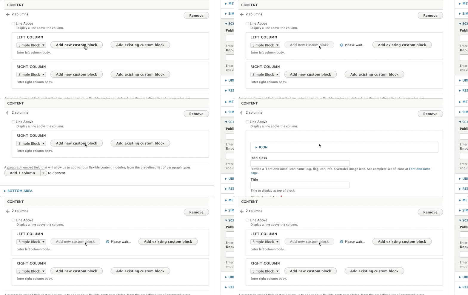
You can then embed that block on another page by searching for it by its description and selecting it from the list of results.
Blocks can be configured on a site-wide level using the Block Layout. These blocks contain global elements such as menus.
Themes define Regions where blocks can be placed. In YMCA Website Services, these regions are typically static.
To view your site’s regions, go to Structure > Block Layout and click on Demonstrate block regions. It is generally not recommended to change the configuration in the Block Layout without proper training.
To change layouts on individual content pages, editors and website managers typically use Paragraphs or Layout Builder.
Paragraphs that support blocks will usually have two buttons: Add New Custom Block and Add Existing Custom Block.

The block description field is required for all block types. This serves as the name for your block and is displayed in the administrative interface. Use clear and descriptive names to easily identify your blocks when embedding them onto pages. Block descriptions are not displayed on the site’s front end.
YMCA Website Services supports different block types for different content needs:
A basic block provides a basic text editor. It is suitable for simple text content, such as descriptions on cards across multiple pages.
The simple block is the block type you will likely use most often. It also provides a basic text editor and is also great for embedding descriptions on cards across multiple pages.
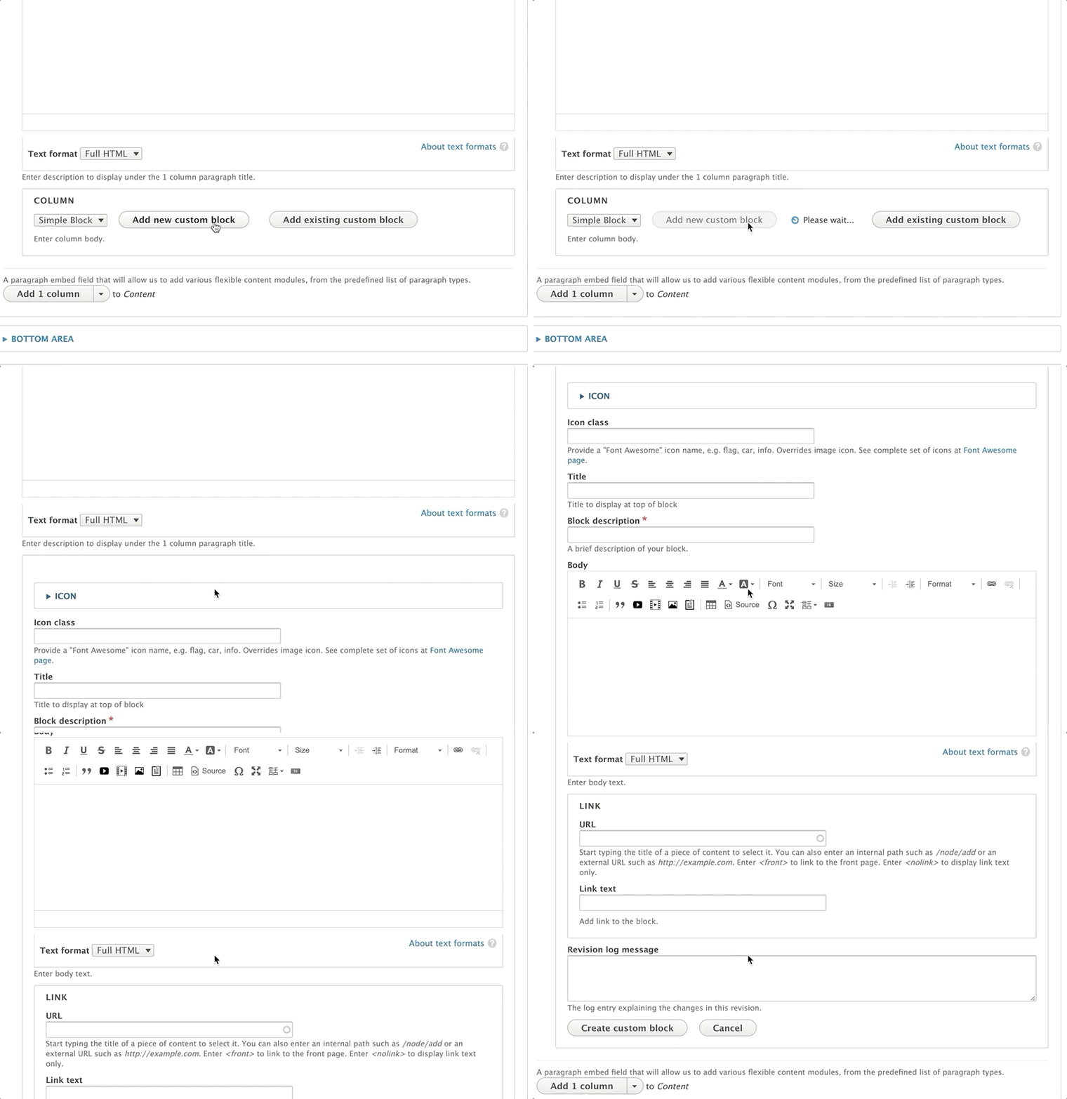
Use this block to schedule and unschedule sections or paragraphs on your page(s).
Using the Date Block Paragraph ⇒
This block allows you to use any type of HTML tag, making it useful for embedding scripts and iframes onto multiple pages. The code block provides more flexibility for technically-inclined content editors.
Layout Builder is a powerful page-building tool for your YMCA website. It allows content editors and site builders to quickly and easily create visual layouts for displaying content. You can customize how content is arranged on a single page, across types of content, or even create custom landing pages with an easy-to-use drag-and-drop interface.
Drupal’s Layout Builder allows content editors and site builders to easily and quickly create visual layouts for displaying content. Users can customize how content is arranged on a single page, across types of content, or even create custom landing pages with an easy-to-use drag-and-drop interface.
YMCA Website Services 9.2.12 introduces a new Content Type: Landing Page (Layout Builder). This new page will allow you to build pages using Sections with different Layouts that contain Custom Blocks. Please contact your development partner if you need assistance updating to the latest version.
To use Layout Builder, you’ll first have to create a new page:
Once you’ve saved, you will see an empty page. Click the Layout tab to enter Layout Builder or go directly there with Save and edit layout.
Navigate to the page you’d like to update, then click the Layout tab, like above.
Once you are in the Layout editor, you can create, edit, rearrange, and delete sections and blocks while viewing the page in a what-you-see-is-what-you-get preview mode.
Changes to the page are not displayed to site viewers until you Save Layout on the page and Publish it.
When in the Layout editor, you will have these options at the top of the page:
After saving your changes, be sure your page is published:
In Layout Builder, you will see the page divided up into Sections and Blocks. Your page may already be populated with some sections to get you started building, and you can change or edit those to fit your page.
Sections create the structure of the page and contain blocks. You can drag and drop blocks between sections, but you cannot move sections themselves—you can only create sections above or below existing sections.
You can remove sections by clicking the small “X” link at the top left of the section. Click on “Configure
Layouts define the structure of a section. YMCA Website Services comes with 1-, 2-, 3-, and 4-column layouts, and each layout has additional configuration options once it’s created. See advanced options for more details.

Some options in this configuration may not yet be fully supported.
While Sections contain the page’s structure, Blocks contain its content. Blocks are boxes of content rendered into a region of a web page.
To create a block, click Add Block in any section of the page, then Create Custom Block.
Your YMCA website has a wide array of blocks to choose from. In this section, you will find detailed descriptions of those blocks.
The Content Editing Pane—the sidebar where you edit blocks —can sometimes be too small to get all of your content in there nicely. Simply drag anywhere on its left border to expand the pane.
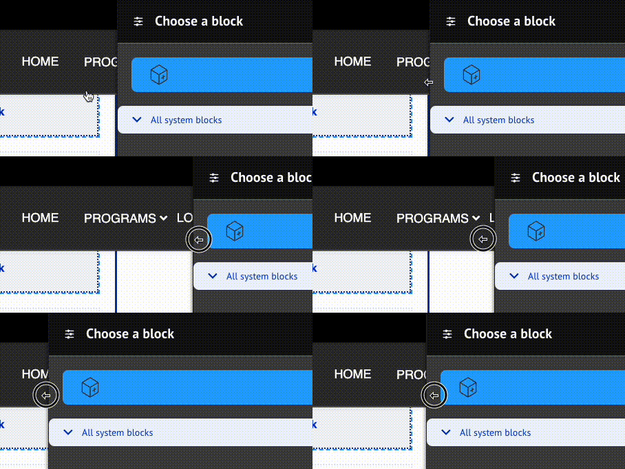
When rearranging large blocks on the page it can often be challenging to drag them around. To make this easier, uncheck Show content preview at the top of the page. This will substitute the “WYSIWYG” preview for block titles, making the content much more compact.
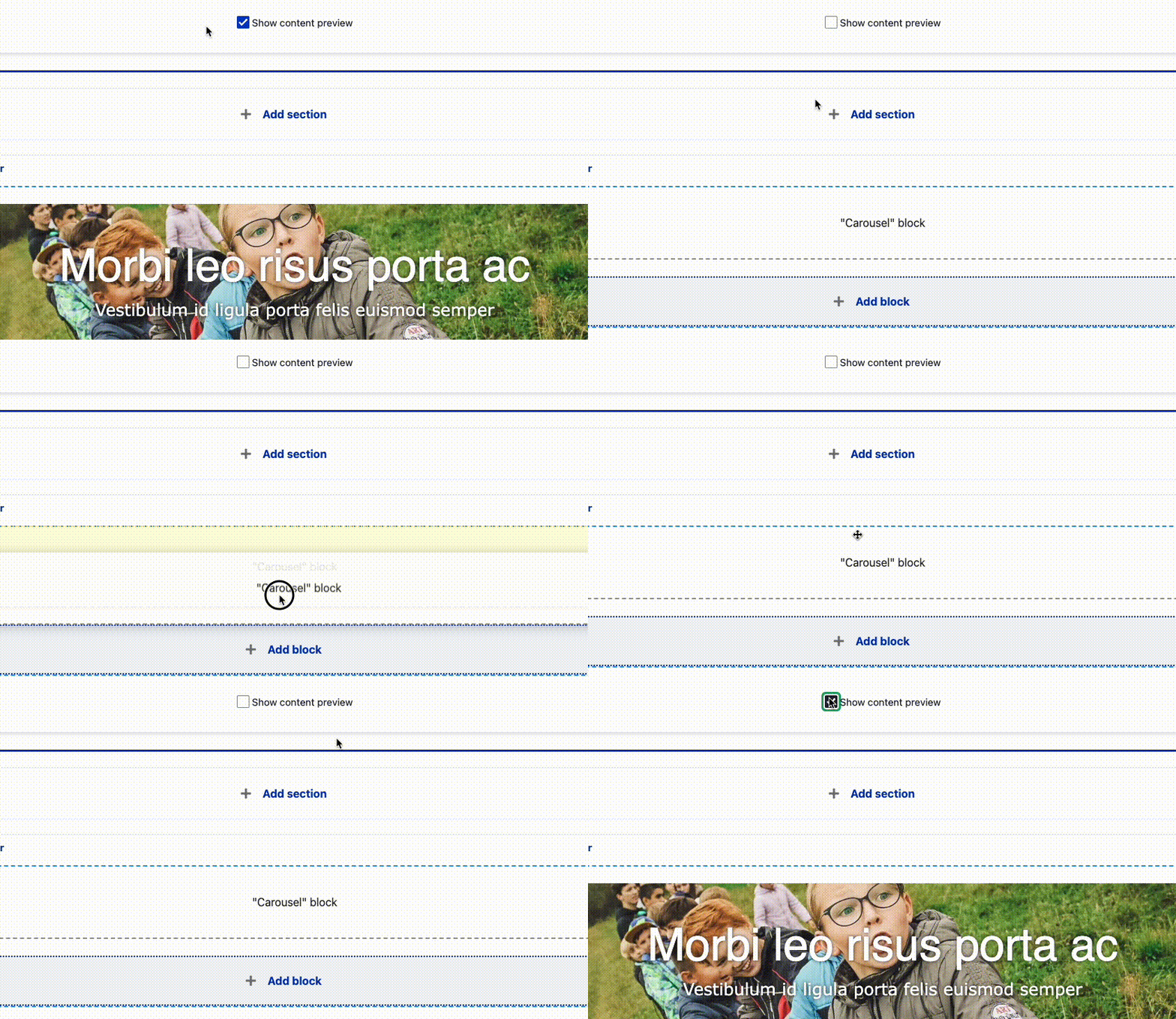
If you run into a problem, get in touch.
Content on this page is adapted from Drupal.org and Western Washington University
The distribution has shipped with two generations of Layout Builder component designs. The first-generation “Pre-release” designs were included with versions 9.2.12 (December 2022) and 9.2.13 (March 2023). The refined and feature-complete “Design System” designs were released in June 2023.
Explore our Design System through our interactive UI kit.
Following the YMCA Brand Guide, the distribution offers four “colorways.” Content editors can use these to apply accessible, brand-compliant styles to all components within a Layout Builder-based page.
| Blue | Green | Purple | Red |
|---|---|---|---|
 |  |  |  |
Refer to How to use the Canadian Colorway for Layout Builder for specific instructions.
The distribution offers new Content Types designed for use with Layout Builder components.
| Article | Branch | Camp | Event |
|---|---|---|---|
 |  |  |  |
You can access each of these components on Layout Builder pages via the Create custom block selector.
A wide range of configuration options are available for Layout Builder components using the contributed Layout Builder Blocks module, which is included with the distribution. In addition to those configuration options, we provide an extra layer of “Y Styles” that help site builders customize their sites in an accessible and brand-compliant manner.
These options provide customizations for Layout Builder-enabled pages at the Content Type, Page, and Block level.
Styles inherit from content types, to pages, to blocks. Some styles can also be overridden at each level - block styles can override page styles, which can override content type styles.
flowchart
  classDef ct fill:#5C2E9133;
  classDef page fill:#92278F33;
  classDef block fill:#C6168D33;
  subgraph ct[Content Type]
    direction LR
    subgraph page[Page]
      direction LR
      subgraph block[Block]
        blockStyles[Block Styles]
      end
      pageStyles[Page Styles]
    end
    ctStyles[Content Type Styles]
  end
  blockStyles -- override --> pageStyles
  pageStyles -- override --> ctStyles
  class ct ct
  class page page
class block blockNote: This configuration may not be accessible to all content editors. Ask an administrator for assistance if necessary.
To access them:
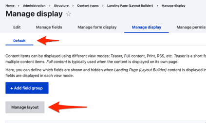
Every Layout Builder-enabled page that you create will allow you to override the default settings. All of these settings will affect all items on a page, unless they are overridden at the block level.


Some blocks have additional styles that can be configured per-block. For these blocks (e.g. Banner, Cards), look for the Y Styles section in the block styles section and set the options accordingly.
When creating or editing a Section you have the option of configuring Layout, Style, and Settings.

Support for these options is a work in progress and may require involvement of your development partner. Feel free to experiment with the options. Be sure to follow proper brand guidelines and accessibility practices.
In this section, you can control the container of the Section.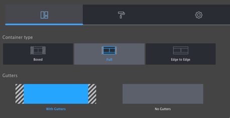
When creating or configuring a block, you have the option of opening the Style tab to access additional style options including:
Support for these options is a work in progress and may require involvement of your development partner. Feel free to experiment with the options. Be sure to follow proper brand guidelines and accessibility practices.
After you have completed setting the Style options, click back to Content and Save or Update to commit your changes.
Designs:
To use the block:
Fill in the content fields:
Then save the block:
Activity Finder combines data from the Activity, Class, and Session content types into an interactive tool. Learn more about Activity Finder.
To use the block:
Configure the Activity Finder block after adding it to a Layout Builder page:
Edit the block within the Layout Builder.
Configure the available options. See Activity Finder Block Configuration for field details. These configurations will affect what users see and can do on the front end.
/admin/openy/settings/activity-finder)./admin/openy/settings/activity-finder) and defaults to:Save the block.
Then save the block:
Designs: Mobile & Desktop
The distribution provides a few blocks to highlight articles:
To use the blocks:
Displays one or more articles in a large feature on the page.
Allows users to filter the Articles Listing by location, category, or text search.
This block has no other options.
Displays articles in a teaser view, filtered by the Articles filter block, with a “Show more” button.
Title (required): Displayed if Display title is checked; otherwise, this is for administrative use only.
Number of articles: The number of articles to show in the listing on first load. Defaults to 3.
Article type: Limit the articles to a specific type. Defaults to “All”.
When you are finished adding blocks, Save and publish your changes.
Designs:
To use the block:
Fill in the following content fields:
<H1> tag if the banner is at the top of the page.This block comes with multiple styles. To choose an alternative style:

Then save the block:
The banner block comes in several variations, including:
Some variations also have “Canada” specific styles in red, white, and black.
These variations can be selected during the block configuration process, allowing you to choose the most appropriate style for your content and design preferences.
Designs:
To use Breadcrumbs within the Layout Builder:
After adding the block, you will need to configure it:
Then save the block:
What are Breadcrumbs? Breadcrumbs are a navigational aid used in user interfaces. They allow users to keep track of their location within a website or web application. The term comes from the Hansel and Gretel fairy tale.
Easy Breadcrumb Module: For more advanced breadcrumb functionality, consider using the Easy Breadcrumb module. This module allows for customization of the breadcrumb trail, including:
The Cards block is similar to the Grid CTA block, but has more fields and places the image behind the item content.
Designs:
To use the block:
Fill in the content fields:
id, target, and class.The Cards block offers several variations that change the look and feel:
This block comes with multiple styles. To choose an alternative style:

Then save the block:
Designs:
To use the block:
Fill in the content fields:
Then save the block:
Designs: This block provides no additional presentation outside of the embedded content. It renders the code you provide directly into the page. Ensure the code is properly formatted and safe for display.
To use the block:
Fill in the following content fields:
!!! warning Be extremely cautious when embedding code from untrusted sources. Unfiltered code can introduce security vulnerabilities and potentially compromise your site. Always validate and sanitize code before embedding it.
Then save the block:
NOTE: This module requires per-provider configuration. Currently, support is provided for donation forms from:
- Blackbaud Online Express
- Convio Luminate
Please submit a feature request for additional provider support.
Designs: Mobile & Desktop
The Y Layout Builder - Donate (lb_donate) and YMCA Website Services Donation Embed Form (y_donate) modules work together to allow content editors to add an embedded donation form to the site and create a separate call to action to direct users there.
The YMCA Website Services Donation Embed Form (y_donate) module provides a block that allows you to embed a donation form directly onto a page.
To get started:
y_donate) module at Administration > Extend.If your embedded form does not work in your non-production environment, you may need to add a domain to the allow-list either on the provider-side or in your site’s Content Security Policy.
If your provider is not listed, you can add the form by selecting the Code Custom Block and pasting in your code. Alternatively, you can work with your development partner to
add a new donation provider. Refer to the
Information for Developers section of the y_donate project for details on how to implement a new provider.
The Donate Block (lb_donate) provides a call to action with donation amount buttons and a link to the embedded donation form page. This block can be placed in an
edge-to-edge container.
To use the block:
Fill in the content fields:
Then save the block:
Designs: Mobile & Desktop
The distribution provides a few blocks to highlight events:
To use the blocks:
Displays one or more events in a large feature on the page.
Allows users to filter the Events Listing by location, category, or text search.
This block has no other options.
Displays events in a teaser view, filtered by the Events filter block, with a “Show more” button.
When you are finished adding blocks, Save and publish your changes.
The Grid CTA block is similar to the Cards block, but allows for more flexible items with a slightly more freeform design. It is also similar to the Icon Grid block.
Designs:
To use the block:
Fill in the content fields:
Then save the block:
Designs:
The header and footer on Layout Builder pages is composed of many complimentary blocks. The Header and Footer are special Sections that are pre-populated on each Layout Builder-enabled content type. If the Header or Footer do not already exist in your content, you can add them on your own.
If a Header section does not already exist, add a new Section and choose the WS Header Layout. Then, add the following blocks by selecting Add block and then using the search box under All system blocks:
Each block has some specific configuration recommendations:
Configuration
Content
Configuration
Content
The option to add a Utility Menu was added in the December 2024 release. This menu is intended to give content editors an additional space for adding links in the top right of the header.
Configuration
Content
Configuration
As per the Brand Graphics Guide (requires Y login):
The areas of impact must appear on a website, but it is at the YMCA’s discretion whether to include them as the trademarked graphic paired with the logo or as a way of telling the story of our positive impact.
If you choose to hide the Areas of Impact in the logo, we recommend you include them elsewhere on the page.
The main navigation supports displaying up to three levels of menu items. When adding items, be sure to check Show as expanded for any parent item that should be expandable.
The main navigation also supports an optional nested CTA block.
Configuration
Content
Configuration
Content
Configuration
Content
highlighted class to the menu item under Attributes > Class.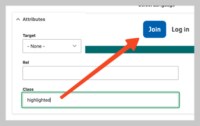
highlighted items from this menu will display.If a Footer section does not already exist, add a new Section and choose the WS Footer Layout. Then, add the following blocks by selecting Add block and then using the search box under All system blocks:
See above. The white logo is recommended for the footer.
Each of these three blocks references a menu. The three menus can be used to split footer links across multiple columns.
Configuration
Content
Configuration
Content
Configuration
Content
This menu is typically for a limited number of links such as “Privacy Policy” or “Terms of Use”.
Configuration
Content
The Main navigation has an additional feature that allows for adding a nested call-to-action that takes the place of the third level of the menu.
To use it:
admin/modules) and enable the Web Services Main Menu CTA Block module (y_lb_main_menu_cta_block).CTA blocks will only be displayed on first-level menu items. Blocks on all other levels will be ignored.
Menu CTA items will not appear on pages that use Paragraphs-based layout. CTAs also ony show on desktop and not mobile displays.
The Icon Grid block shares similarities with the
Cards and
Grid CTA blocks but offers a way to display more basic items with a slightly more constrained design. It is based on the lb_icon_grid block content type and uses icon_grid_item paragraphs.
Designs:
To use the block:
Fill in the content fields:
field_cta field.field_icon_columns field.field_grid_items field, which references icon_grid_item paragraphs. Each item has the following fields:field_title field.field_description field.field_media field.Then save the block:
Designs: Mobile & Desktop
The Location Finder block provides search, filters, a map, and a listing of your YMCA locations.
Location Finder also now supports hierarchical amenities. That means you can arrange your list of amenities into categories instead of a simple alphabetical list.
The Amenities taxonomy is managed at Administration > Structure > Taxonomy > Amenities. See Taxonomy, Vocabularies, and Terms for more info on managing Vocabularies.
If you leave the Amenities terms in a flat list on their configuration page, the Location Finder filters will display according to their configured weights. Drag terms up or down in the list to rearrange them in the filters.
Y’s with many amenities may choose to group them in categories. Once any Amenities term is nested, the Location Finder filters switch to a hierarchical display.
To nest terms:
NOTE:
- Any terms more than two levels deep will be ignored. (That is, parents and children will be displayed, grandchildren will not.)
- When nesting is enabled, any amenities that are not grouped will be hidden from the filter list.
The Location Finder block is best placed in an edge-to-edge Section with no gutters.
To use the block:
Fill in the content fields:
Then save the block:
Designs:
To use the block:
Fill in the content fields:
Then save the block:
Designs:
To use the block:
Fill in the content fields:
Then save the block:
Designs:
To use the block:
Fill in the content fields:
Then save the block:
Designs:
To use the block:
Fill in the content fields:
Then save the block:
Designs:
To use the block:
Fill in the content fields:
Title (required): This title is for administrative purposes only and is never displayed to end users, even if “Display Title” is checked.
Section title (required): The heading for this section.
Link: An optional link to be displayed near the title.
Type: Select how you would like to choose the related articles in the block. Each type has different options:
Items count to display: The maximum number of items to display in the list: 3, 6, 9, or 12.
Then save the block:
Designs:
To use the block:
Fill in the content fields:
Title (required): This title is for administrative purposes only and is never displayed, even if “Display Title” is checked.
Section title (required): The heading for the related events section.
Link: An optional link to be displayed near the section title. This can be a link to a page with more events, for example. As of the December 2024 release, Related Events links can use link attributes.
Type: Select how you would like to choose the related events in the block. Each type has different options:
Items count to display: The maximum number of items to display in the list: 3, 6, 9, or 12.
Then save the block:
Repeat Schedules combines data from the Activity, Class, and Session content types into an interactive tool. Learn more about Group Schedules.
Before you can use the Repeat Schedules block, you will need to:
openy_repeat module is updated to
at least 2.2.0.lb_repeat_schedules) module at Admin > Extend (/admin/modules).To use the block:
Configure the options:
lb_repeat_schedules block content type.Then save the block:
Designs:
To use the block:
Fill in the content fields:
Then save the block:
Additional Information:
The Simple Menu block is a useful way to display a list of links in a sidebar. Menus are a collection of menu links that are used for site navigation. You can create new menus and menu links, reorder links, and disable links provided by modules. For more information about managing menus, refer to the Drupal User Guide.
To further customize the appearance of the menu, you can adjust the theme settings or use CSS to style the block. The administrative toolbar also provides a way to manage menus and their associated links. You can access it under Structure > Menus.
The Simple Schedule block pulls content that is added via the Simple Schedules module, along with other Sessions on the site, displaying them in a calendar format. It’s crucial to configure your schedules using the Simple Schedules module before adding this block to your site to ensure content is displayed correctly. This block leverages existing session data and presents it in a user-friendly, calendar-based view.
Designs:
To use the block:
Fill in the content fields:
Then save the block:
The Table block allows users to add simple content and responsive tables to Landing Pages (Layout Builder content type). It utilizes the Tablesaw library for responsive table functionality.
Designs:
Then save the block:
To configure the Table block, fill in the following content fields:
Title (required): This title is for administrative purposes only and is never displayed, even if Display Title is checked.
Section title: This title is displayed as a heading above the table and other content.
Section subtitle: This subtitle is displayed below the heading.
Body: This field provides a full text editor for adding tables, text, images, and other content to the page.
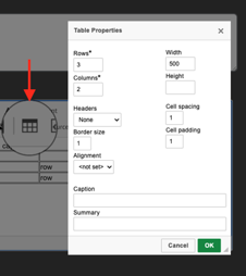
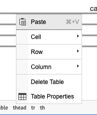
Then save the block:
Designs:
To use the block:
Fill in the content fields:
Then save the block:
Designs:
To use the block:
Fill in the content fields:
Then save the block:
Designs:
To use the block:
Fill in the content fields:
field_title field of the tab_item block content type.field_description field of the tab_item block content type.Then save the block:
Designs:
To use the block:
Fill in the content fields:
Then save the block:
Designs:
To use the block:
Fill in the content fields:
Title (required): This title is for administrative purposes only and is never displayed, even if “Display Title” is checked.
Form title: This title is displayed as a heading above the embedded webform.
Form subtitle: This subtitle is displayed below the heading.
Webform (required): Choose the Webform to embed on the page from the list of existing forms.
Then save the block:
YMCA Website Services content editors use Paragraphs to create flexible and unique layouts for their pages. Each Paragraph is a self-contained section of content with its own styling, functionality, and fields. Paragraphs are based on the Paragraphs Drupal module.
You can add a Paragraph to a page when you see the Paragraphs field. These Paragraphs are typically placed within one of the four main “Areas” of a content type:
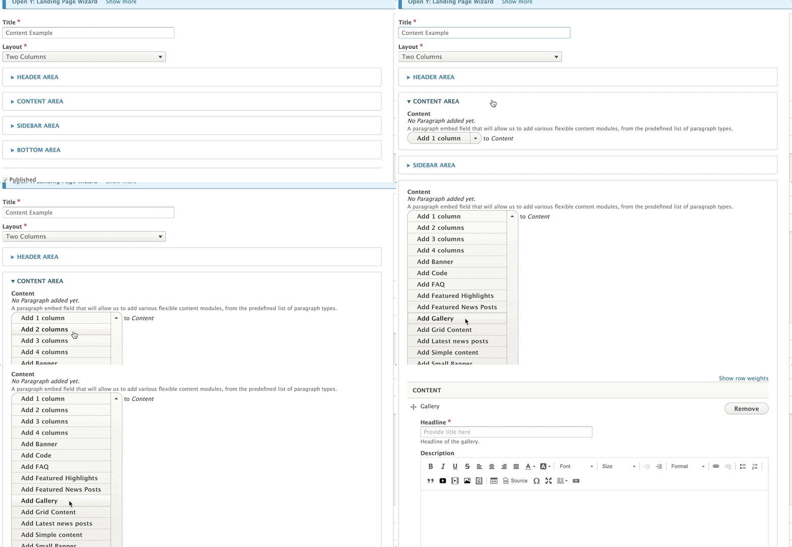
Not all content types use all four areas. Some content types might use fields directly to populate the Sidebar Area, while others might use an Image field instead of a dedicated Header Area.
Content editors can add Paragraphs to a page using either the inline editor or the admin portal.
To add a Paragraph to an Area:
The video below provides an example of the functionality of Paragraphs; however, the specific layouts demonstrated are not YMCA Website Services layouts.
If you’ve upgraded to YMCA Website Services 2.4 or later, you can add a Paragraph from the front-end:
Note: Not all Paragraph types are available for inline editing yet. More Paragraphs will be added to the inline content editor in future releases.
If the initial layout doesn’t meet your needs, you can easily rearrange sections:
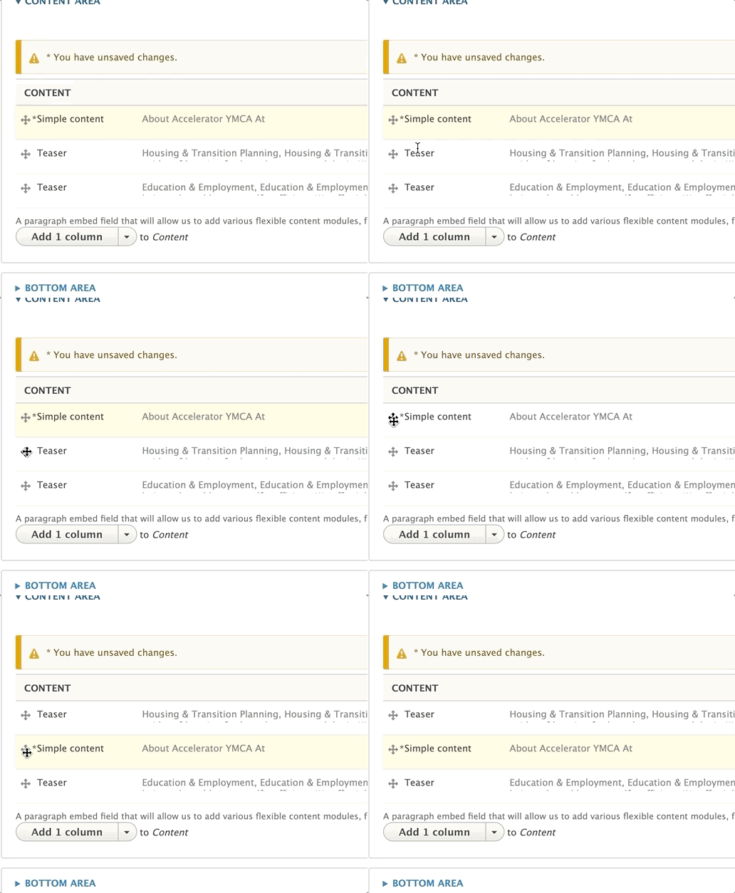
To correct a typo or update content, click the edit button next to the Paragraph. This will open the Paragraph for editing.
To remove an unwanted section, click the remove option from the dropdown menu next to “Edit.”
YMCA Website Services offers over 50 Paragraph types out of the box, and customizations by your partner might add even more. This documentation focuses on the standard Paragraph types available with YMCA Website Services and how to use them.
After selecting “1 Column” from the paragraphs dropdown, you will notice the following fields:
Details on each field are below.
While the paragraph can be used only with the fields above, 1 column also supports custom blocks of content. For this paragraph type, it’s recommended that users stick with “Simple block” types.
When adding your custom block, use the font-awesome icon class instead of the custom icon image field. In Carnation, the image option tends to get too large.
Learn more about custom blocks ⇒
Read about the Font Awesome icon library ⇒
The purple font color for paragraph descriptions can be overridden in Lily and Rose by targeting .paragraph-1c-wrapper .field-prgf-1c-description.
Example:
.paragraph-1c-wrapper .field-prgf-1c-description {
  color: inherit;
}
Content editors who want to edit this CSS can ask their developers to install the CSS Editor module and edit their styles directly from the User Interface.
Learn more about custom blocks ⇒
Unlike similar paragraphs (such as 1 column paragraph and Grid Content), there is no title field. To add a Title, insert a Simple Content paragraph above your 2 columns paragraph.
There is an optional checkbox to display a horizontal rule above the two columns.
If you want to add multiple rows of content with 2 columns, add a new 2 columns paragraph for each set of two you want (e.g., if you have five blocks of content, add three 2 columns paragraphs).
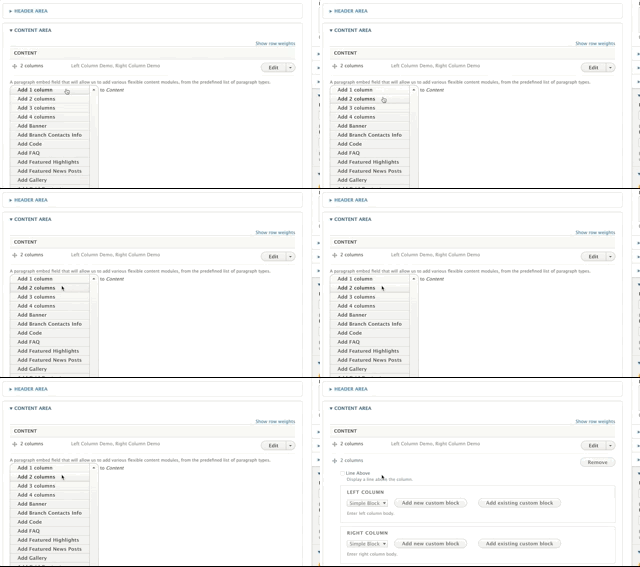
The 3 Columns paragraph provides a way to display content in a visually appealing and organized manner. Here are a few examples of how it looks in different themes:
The 3 Columns paragraph can be used in the following areas:
The 3 Columns paragraph allows you to create a row with three custom blocks of content. Here’s how to use it:
Select 3 Columns from the Paragraphs dropdown.
Title: Add an optional title. The title will appear in all caps at the top of the 3 columns section.
Add custom blocks to the Left Column, Center Column, and Right Column fields.
If you want to add multiple rows of content with 3 columns, add a new 3 Columns paragraph for each set of three blocks you want to display.
The 3 Columns paragraph is available for use in the following content types:
Important: This paragraph does not work out of the box in the Carnation theme. See the “Advanced” section for theme-specific considerations.
Content editors can use Grid Content or Featured Content paragraphs to achieve a similar layout.
Select 4 Columns from the Paragraphs dropdown.
Title: Optional large, all-caps title displayed at the top of the paragraph.
Line Above: Adds a horizontal rule above each column.
Description: A subheader/section description displayed below the title and above the columns. Uses the text editor for styling.
Add custom blocks to the First Column, Second Column, Third Column, and Fourth Column fields.
Adding Headers to Individual Blocks
Out of the box, the Title field in each custom block renders as plain text. To work around this, add your headers directly within the text editor of the custom block.
See the Advanced section for details about how to address this with CSS.
If you want to add multiple rows of content with 4 columns, add a new 4 Columns paragraph for each row. For example, if you have seven blocks of content, add two 4 Columns paragraphs (the second one will only have 3 columns populated).
Learn more about the link field ⇒
In all three themes currently in YMCA Website Services (Lily, Rose and Carnation), the Title field’s default styling may appear similar to the body copy. To override this and apply a more prominent style, target the .field-sb-title CSS class in your theme’s stylesheet.
By default, the 4 Columns paragraph may not render correctly in the Carnation theme, with columns stacking vertically instead of horizontally on desktop. To fix this, the .wrapper containing the column elements needs to be changed to .row using CSS.
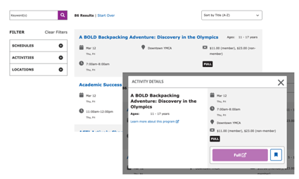
See a live example of Activity Finder in our sandbox site.
This paragraph type embeds a block. The specific block used determines the functionality and appearance of the Activity Finder. Multiple Activity Finder block types exist, including:
This paragraph type requires an integration into a CRM. See Program Activity Framework for a list of existing integrations. Any other CRM will require custom developer work.
How you use these paragraphs will depend on how your Association has structured its program data on the CRM and on how you decide to get people to program results.
To start, add the Activity Finder Paragraph or Block to a page.
See Activity Finder Block Configuration for more details.
Warning: This paragraph is deprecated and provides similar functionality to the “Location filter by amenities” paragraph. It is no longer recommended for use by the YMCA Website Services Core Team. Consider using the “Location filter by amenities” paragraph instead.
What It Does:
Shows a list of branches with icons indicating the amenities available at each branch. Includes a checkbox field to filter branches by amenities. This is implemented via the lb_branch_amenities_blocks module.
Areas Where It Can Be Used:
After selecting “All Amenities” from the paragraphs list, you can change the title that displays above the search checkboxes by entering text in the Title field.
Styling can differ greatly based on the theme. Use of this paragraph in Rose is not recommended.
Supported Content Types
Related Paragraphs
To add a banner, select Add Banner from the paragraphs dropdown in the Header Area of your content. Then, fill out the following fields:
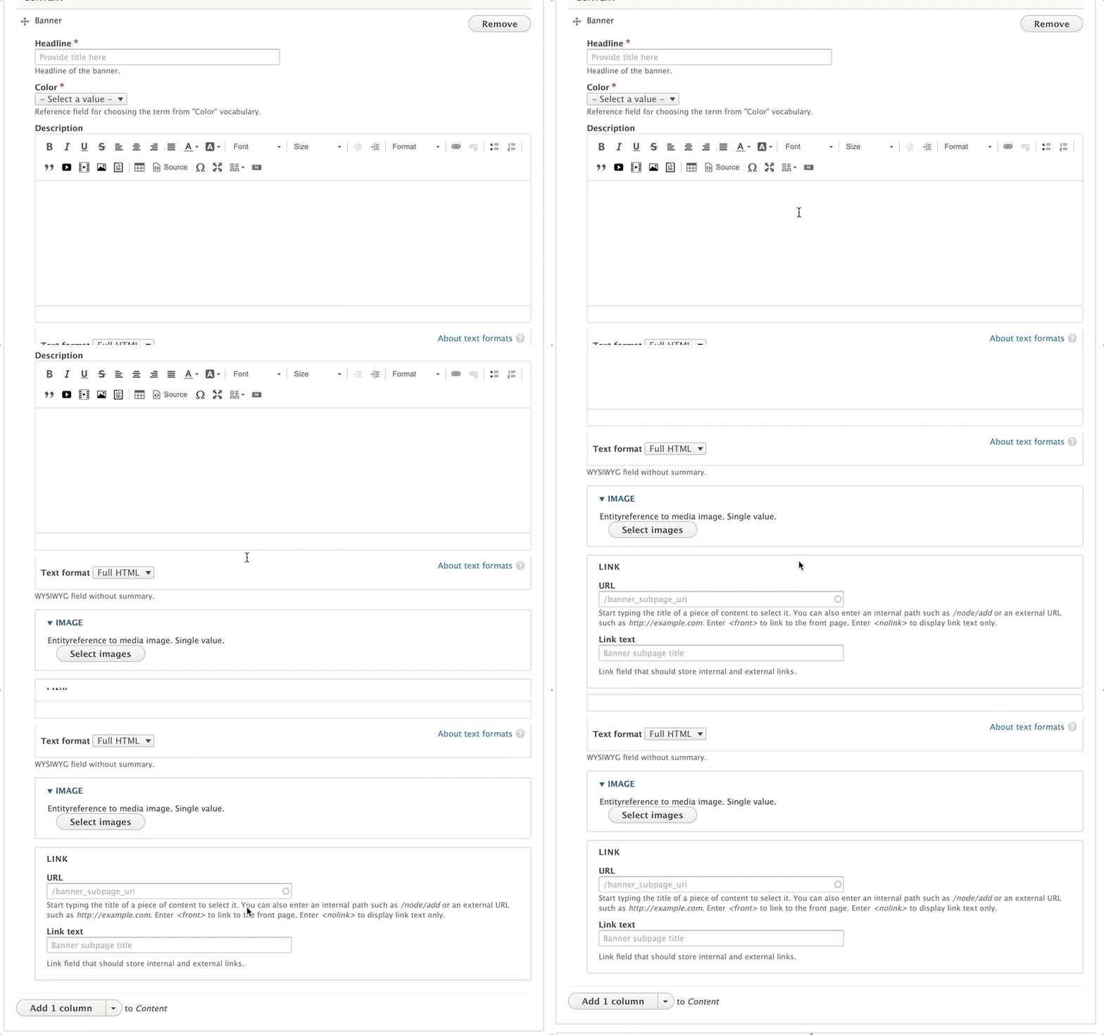
Title (required): This field adds a headline to your banner. The placement of the title will depend on your theme and customization, but it will typically appear as large, all-caps text.
Color (required): The background color for your banner. You typically will not see this color in Lily or Carnation, but in Rose, it will display behind your text. Choose from the list of available options. This references the Color vocabulary.
Description (optional): Displays beneath your Title. You have the option to style your text using the text editor, but it’s not as consistent as other places where you typically see the editor.
Recommendation: Just enter basic text and don’t do anything beyond basic styling, such as bold or underline.
Image:

Use the image library to embed an image. You can upload a new image from your computer or reuse an existing image from your library. The image field is optional, but recommended.
For recommended image sizes for your YMCA Website Services site, talk to your agency partner.
How to add/edit images >
Link/Button: Add a URL and a link to the button on the page. The button on your banner cannot be styled without custom CSS/code. [Using link/button fields ⇒](../../text-editor/building-buttons)
Note: If you know a little CSS, you can have your agency partner [install the CSS Editor]( https://www.drupal.org/project/css_editor) module, and you can target
.btn.banner-btnto change the default button.
This paragraph allows you to display a listing of blog posts with optional search and filtering capabilities. The appearance and available options might vary based on the theme (Carnation, Lily, Rose).
Before adding the paragraph, create the menu you want to use. You can create a new menu at Admin > Structure > Menu > Add menu (/admin/structure/menu/add).
After creating the menu, add links to it by navigating to Admin > Structure > Menu > [Your Menu] > Add link (/admin/structure/menu/manage/[your-menu-name]/add).
Learn More About Link Fields ⇒
To add additional links to your menu, click on the Add Another Item button.

Once you’re done adding your menu links, scroll down to the Header Area and add the Camp Menu block via Layout Builder. Click Save.
Note - While it is technically possible to position the Camp Menu above your banner image, it is not recommended. The Camp Menu has layout issues on desktop in the Carnation theme, and in all themes it can be hard to distinguish the Camp Menu from your main navigation.
When a user views your Camp Menu on mobile, the menu doesn’t collapse; it merely shrinks. Menu items either disappear or wrap onto a new line if they do not fit the space.
It’s recommended you limit your menu items to no more than 3 or 4 unless you opt to customize the styling.
On a Programs page, go to the content area and click to open it.
Select Categories listing.
This paragraph can only be used on programs pages that have subcategories tied to them. If a program has no subcategories tied to it or if it’s used on another content type, it will not work.
Learn more about programs content type ⇒
Learn more about program subcategories content type ⇒
Select “Add Code” from the paragraphs dropdown.
You will see two options: “Add Custom Block” to create a new code block, or an autocomplete field to search for and embed an existing custom block.
To search for an existing custom block, type the name of the block in the autocomplete field and click on an option that appears to embed that block.
To add a new block, click the “Add New Custom Block” button.
When you add your block, you will see a blank, unformatted text field. Type your HTML text into this field.
Important Considerations When Using Code Blocks:
- To use code, you must add HTML tags.
- Hard returns will be ignored, and text will be printed out in one long string. Use HTML line breaks (
<br>) or paragraph tags (<p>) to format your text.- Code will not highlight or color-code your HTML. To display code snippets with syntax highlighting, consider using a different paragraph type or a dedicated code highlighting library.
There is an option to change to a “Full HTML” text editor within the block configuration, which will allow you to make use of the default text editor. However, using this may strip “faulty” or disallowed HTML out of your block and may prevent you from using certain tags. Exercise caution when using the “Full HTML” editor for code blocks.
Once you’re done, click the button that either says Add custom block or Update custom block, depending on the option you had selected at first.
If you are using Date Block for the first time or want to create a new, unique date block:
Choose the Add New Custom Block option.
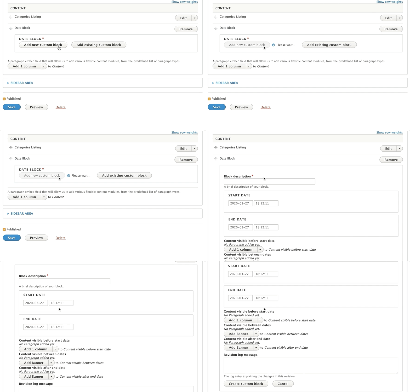
Enter a descriptive Label for your date block in the Block description field.
Enter a Start Date and End Date for your block.
Add paragraphs to the designated areas to display content Before, During, and After your scheduled dates.
If you do not want content to display before, during, or after your specified time period, leave the corresponding field blank.
Click Create custom block to save your date block.
To reuse a date block that you have previously created:
Click the Add Existing Custom Block button.
Enter the Label of your block into the autocomplete field.
Select your block from the options to add it to the content area.

To edit a Date Block:
Any changes made to a date block will be applied to every page where that block has been added.
Prerequisite: Requires integration with third-party tool GroupEx Pro.
To integrate your GroupEx Pro account:
For information on where to find your GroupEx Pro account number, visit groupexpro.com.
Select FAQ from the paragraph dropdown
Add a title or a Question into the Question field. This will show as the title of your section. This will be the title of the accordion.
Use the text editor to provide an answer/expanded section of content that is revealed when the user clicks on the section title.
To add another Question and Answer, click the Add another item button at the bottom of your paragraph.
If your FAQ contains Frequently Asked Questions, consider enabling the “FAQ?” option within the paragraph to output them as structured data. This can improve your site’s visibility in search engine results. Ensure the content contains individual sets of questions and answers.
Review Google’s Content guidelines for FAQs for more information.
Only one FAQ paragraph should be added to a page to ensure correct structured data output.
This paragraph is rendered differently depending on the theme. Here are some examples:
The Featured Blog Posts paragraph is ideal for:
This paragraph can be used in the following areas:
| Field | Machine Name | Required | Description |
|---|---|---|---|
| Headline | field_prgf_headline | No | Title of the featured blog posts section. |
| Blog Posts | field_fblog_posts | Yes | References to the blog posts you want to feature. Supports multiple blog posts. |
The “Featured Blog Posts” paragraph can be added to the following content types:
*Note: The styling for Featured Content differs greatly by theme. This documentation notes the differences in styling between each theme.*
Select Add featured content from the paragraphs dropdown. Add an optional headline in the headline field above.
Next, add an optional Description using the text editor. Avoid changing your text alignment for your description.
Add an optional link in the link field.
Learn how to use a Link field ⇒
Select the number of columns you would like to have in each row using the style dropdown.
Advanced users: You can clear the confusion for content editors in Carnation by making the style field an optional field and hiding it in the form display in the UI.
Additionally, you can limit the number of columns to four in the Featured Content’s paragraph settings.
Finally, add content for each column of content using the text editor. To add additional columns click the “Add Another Item” button.
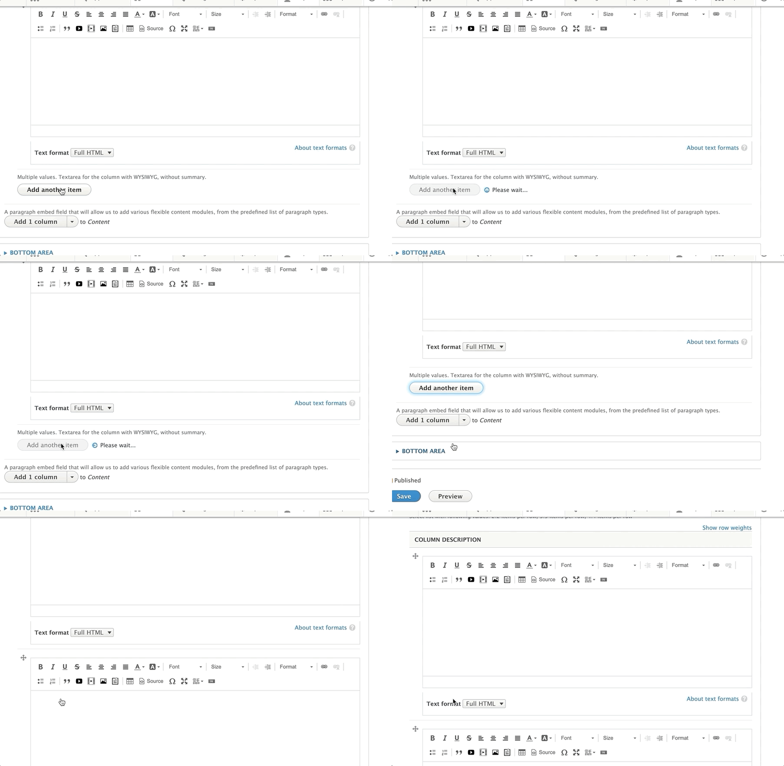
The gallery can play on a loop, and users can click back and forth using the arrows.
You can have a gallery with a simple title. You can also add a description below the headline and/or a call to action button.
Once you’ve selected a gallery from the paragraphs dropdown, enter a Headline for the gallery.
Next, if you would like to add a subhead or description below your title, add it below the headline in the Description field.
Only use basic text formatting on your description, such as bold or italicized text. Avoid using headlines, bullets, or numbered lists in this field.
Optionally, you can add a Link in the link field.
Below the link field, you will add your images. Click on the Add images button to select the pictures for your gallery. You can upload an image to the media library, or select multiple images from your library.
Once you’ve uploaded/selected your images, click that blue Add images button at the bottom.
To order your images, hover your mouse over the thumbnail in the “Images” section, and then drag them to reorder. You will see a cross-arrow icon when you’re dragging them around, similar to what you see when you reorder paragraphs.
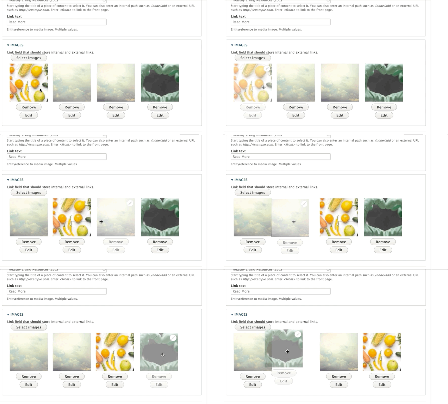
To delete a photo from the gallery, click the delete button below the image.
Hit Save at the bottom of the image to save it.
Note on Grid Content: This paragraph’s style will vary greatly depending on your theme. The docs outline how to use the fields.
First, choose Grid Content from the Paragraphs dropdown. You will then see a dropdown with options under Style, determining the number of items per row:
Select a style to choose how many sections/cards you want to display in a row; the more items per row, the narrower they will be.
Next, you will see a button that says Add Grid Columns. Click this button to add individual sections/cards.
For each item you add, you will have the following fields:
Headline (optional) - A title for your section. The size will vary depending on your selected style and theme.
Icon (optional) - An image to display inline with your headline. Upload a new image or use one in your image library.
Icon Class - A Font Awesome icon CSS class. Type the name of the class, and the system will generate the icon.
Description - A standard text editor field. Because of how each grid content item is styled, it’s recommended that the text in this field be shorter than 200 characters.
Link - Two fields to add a URL and link text. Depending on your theme, the link will style either as a basic link or as a button.
Note: If you add more items than your selected style, you will create a new row. For example:
- 2 items per row style, 3 items added -> two rows of content
- 3 items per row style, 5 items added -> two rows of content
- 4 items per row style, 9 items added -> three rows of content
These paragraphs embed a listing of blog posts, sorted by the most recent, in a card design. They utilize a dynamic paragraph that renders blog posts.
Unlike the related Blog Posts Listing, this paragraph does not include filters for searching blog posts.
These paragraphs embed listings of news posts, sorted by the most recent, in a row/listing design. There are three variations:
From the paragraphs dropdown, add the desired “Latest News Posts” paragraph type. Enter a header title for the section in the text field, and save.
Go to the Bottom Area and select Limited Time Offer. Fill in the Title field for your main headline, and if you would like to add a subheader below the title field, use the Subtitle field.
To add a button, use the Link field.
| Name | Machine name | Required | Description |
|---|---|---|---|
| Title | field_lto_title | No | Enter title for the Limited Time Offer. |
| Subtitle | field_lto_subtitle | No | Enter subtitle for Limited time offer. |
| Link | field_lto_link | No | Add a link for the Limited Time Offer button. |
See Membership Calculator and Membership Content Type for more information about related features.
The Membership Calculator paragraph can be added to these areas of a content page:
From the paragraphs dropdown, add the News Posts Listing. Enter a header title for the section in the text field and hit Save.
Note: Advanced users can make changes to the exposed fields using the Views module and the paragraphs settings. This requires advanced knowledge of Drupal’s Views and Paragraphs modules.
It is generally not recommended to use the News Post Listing on Branch, Camp or Facility pages due to the availability of the Latest News Posts/(Camp)/(Branch) paragraph.
The Promo Card comes in three default color variations: Carnation, Lily and Rose.
In your sidebar area, select Add Promo Card from the paragraphs list.
The Promo Card has the following fields:
Title: (Optional) A large title that appears at the top of the card. (Machine name: field_prgf_title)
Headline: (Required) A smaller headline that appears below the title. (Machine name: field_prgf_headline)
Description: (Optional) A WYSIWYG text editor field for entering content. Standard text editor options are available. (Machine name: field_prgf_description)
Link: (Optional) A link field for adding a call to action. (Machine name: field_prgf_link)
Sometimes called “Group Exercise” or “Group Schedules”, the Repeat Schedules block provides a similar view to Activity Finder, but focused more on recurring, often drop-in classes.
See Group Schedules for more details, including available block configuration options and a description of the front-end display.
To use the Repeat Schedules paragraph:
Warning: This element does not work properly in the Carnation theme and is considered deprecated. It may be removed in a future update.
The Secondary Description and Sidebar paragraph type provides a two-column layout in the bottom area of a page. It allows you to insert reusable content blocks into a left and right column.
| Name | Machine Name | Required | Description |
|---|---|---|---|
| Left Column | field_prgf_left_column_block | No | Block reference to: Basic Block, Code Block, Date block or Simple Block. Create a new one or pick up an existed block. Content placed here typically serves as a secondary description for the page. |
| Right Column | field_prgf_right_column_block | No | Block reference to: Basic Block, Code Block, Date block or Simple Block. Create a new one or pick up an existed block. Content placed here typically serves as a sidebar with related information or calls to action. |
Insert the paragraph from the dropdown menu into the Bottom Area of your page.
You will see two fields: Left Column and Right Column.
Within each column, you can select from one of four different custom block types:
You can either add a new custom block or reuse an existing block.
Learn how to use custom blocks >
Note: When reusing blocks in this paragraph type, the icon field may not render correctly. Font Awesome icons might display as plain text. If you need icons, consider using inline images.
The Simple Content paragraph allows you to add and format text using the WYSIWYG editor. This provides a flexible way to add basic content to your pages.
From the paragraphs dropdown within the desired area (Content, Sidebar, or Bottom), select Add Simple Content.
A text editor will appear. You can style your text using the editor’s toolbar. This toolbar typically includes options for:
Refer to the Text Editor documentation for details on using the editor toolbar.
Note: In some themes, stacking multiple Simple Content paragraphs directly on top of one another may not provide enough visual separation.
To address this, consider adding:
- A pair of hard returns (pressing the Enter key twice) at the bottom of your text.
- A horizontal rule (using the horizontal line option in the text editor toolbar) to visually divide the sections.
Title (required): This field adds a headline to your banner. The placement of the title depends on your theme and customization, but it typically appears as large, all-caps text. The character limit for this field is 255.
Color (required): The background color for your banner. In Lily and Rose, this background color displays behind your title and description.
In Carnation, you will not see the background color unless you add an image.
Description (optional): Displays beneath your Title. You can style your text using the text editor; however, it’s not as consistent as other places where you typically see the editor.
Image (optional, but recommended): Use the image library to embed an image. You can upload a new image from your computer or reuse an existing image from your library. For best results, consult with your agency partner regarding recommended image sizes for your YMCA Website Services site.
Note: Image Upload does not work in Rose.
Note: Unlike the Banner, Small Banners don’t have a specific Link field for buttons without customization.
To add a button to a small banner, use the Text Editor button tool to create a button in your description field.
AddThis services have been deprecated as of 5/31/23, and this block ceased functioning on that date.
This block is no longer functional due to the discontinuation of AddThis services.
See Using AddToAny for a recommended replacement and other options for sharing content.
For integrating social media feeds, also consider the Social Feed Fetcher module.
The Story Card Paragraph works best with the Lily and Rose themes. It is available, but not themed with a border in Carnation.
To work around this, add a > or another special character to indicate to users that they are clicking on a link.
While this component is available to use in Carnation, it is not themed with a border as in Lily or Rose. The best practice is to use this paragraph sparingly and only in the following content types:
In Carnation, the Story Card works best inside the News Post, Event, and Blog Post paragraphs.
Note: In the headline area on Lily and Rose, a large quotation mark will display to the left of your headline. This can be easily disabled using the following CSS:
.story-card .quote svg { display: none; }
The Teaser paragraph is a versatile component designed to highlight key content. It typically includes an image, a title, a brief description, and a call-to-action link. It can be used to promote specific programs, services, or events.
The appearance of the Teaser paragraph can vary depending on the theme:
Insert the paragraph: From the content area, select “Add Teaser” from the paragraph dropdown menu.
Fill in the content fields:
Save: Save the page to view your Teaser.
Prerequisite: You must have your web form created before embedding it onto a page. You can continue to revise and edit your form after embedding, but this process will NOT create a webform for you.
Once you’ve selected Webform from the paragraphs dropdown, select the name of the webform you want to embed onto your page.
Next, you will have the option to open, close, or schedule open/close dates for your webform.
The “Default submission pairs” field allows you to pre-populate certain fields in your webform with default values if users leave them blank. Unless you have advanced knowledge of YAML, it is not recommended to configure this field.
Taxonomy, in YMCA Website Services, is a system for classifying and organizing website content. It uses organized lists of categories to group content, create folders for Images ( in YMCA Website Services 2.4 and later), and create standard options for dropdown fields. Think of it as a way to tag, filter, sort, and group your content.
Each list of categories is called a Vocabulary, and each individual category within a vocabulary is called a Term. Terms consist of a Term Name and can include additional data or settings specific to that vocabulary (see Vocabularies in YMCA Website Services for details). Taxonomy terms are an entity type
You can rearrange your terms by hovering your mouse over the cross icon and dragging them. This determines the order in which they appear on your website. By default, terms are displayed alphabetically if no specific order is set.

Moving a term to the right will “nest” it underneath another term, creating a parent-child relationship. The nested term becomes a “child” of the term above it. This allows you to create hierarchical taxonomies.
On the next page, you can add a Name for your vocabulary and an optional Description.
Below those two fields, you can add additional information unique to your vocabulary. The available fields will depend on how the vocabulary is configured.
The Color Vocabulary provides a standard list of color options across your website, such as for a background color for your header.
- Go to Structure > Taxonomy > Color.
- Click List Terms.
- Click Edit next to Grey.
Below the name of the Grey term, you’ll find a color widget where you can change your standard shade of Grey across your site.
In this example, you can change the color of the Grey term in the Color Vocabulary using a Color widget.
Vocabularies are lists of categories. How they are used and displayed depends on the specific vocabulary. Here are some common vocabularies in YMCA Website Services:
Used for tagging branches with amenities (e.g., “Pool,” “Sauna,” “Gym”). Amenities are displayed on the branch page and can be used as filters on a locations page.
The Color vocabulary provides a list of colors for use across your site, primarily in page headers, small banners, galleries, and banners. Using a standardized color vocabulary ensures brand consistency.
These vocabularies are used to tag blog and news posts. Categories are often displayed in the sidebar and as filters in the Blog Post Listing and News Posts Listing paragraphs, respectively.
This vocabulary creates folders for organizing images in the media browser.
This vocabulary creates tags for filtering images (YMCA Website Services 2.3.3 and earlier), documents, and videos in the media browser. Using tags helps you organize and find media assets more easily.
Core media items include audio, images, documents, and videos. You can add other media types, such as social media posts, through contributed modules. Media items may be files located in your site’s file system or remote items referenced by a URL. Media items are content entities divided into media types (which are entity sub-types); media types can have fields. The media library is a visual user interface for managing and reusing media items. Add media items to content using Media reference fields and the Media library field widget.
An image style is a set of processing steps, known as effects, that can be applied to images. Examples of effects include scaling and cropping images to different sizes. Responsive image styles can associate image styles with your theme’s size breakpoints. This allows serving images sized for the browser width.
Modules that provide media-related functionality include:
Learn more about media management in the distribution. Some of these videos use older versions of the distribution.
Your YMCA website has the ability to upload media (images, documents, videos) in bulk (since 9.2.12 - December 2022).
You can batch/bulk upload from Admin > Content > Media (/admin/content/media) or Media Browser (/admin/content/browser). After uploading media, it will be available from the Media list and browser in any component on your site.
/admin/content/media)/admin/content/browser)Because this is one of the most well-documented applications in the Drupal community, we recommend using the documentation provided by the maintainer of the Webform module, Jacob Rockowitz.
After members log in to your website, they can browse a diverse selection of gated content—on-demand videos, written content, and live events—from any device.
Below are links to various videos and documents providing basic setup and management information for your new Virtual Y environment. Choose the format that best suits your learning style.
Virtual YMCA (VY) is based on Open Y and was originally built as an extension for Open Y sites. Therefore, it shares many of the same underlying functionalities and concepts.
Virtual YMCA utilizes the same content editing tools as Open Y. However, the pre-configured features and modules available “out-of-the-box” may differ from a standard Open Y installation. It’s best to review the specific modules enabled in your VY instance, such as the ones provided by the ws_small_y module collection (see below), to understand its capabilities.
Virtual YMCA comes with several content types designed for delivering exclusive member experiences. These content types are typically accessible behind a login.
Reach your members even when they’re away from the physical Y. Provide on-demand classes, kids’ activities, and other engaging video content. This is an excellent option for health seekers, families, and active older adults.
Virtual Y Videos can be added individually or through automation using the separate Virtual Y Video Automation application.
Integrates with: YouTube and Vimeo
Stream your popular classes and events to members in real-time. Live Streams are well-suited for events where audience interaction is minimal.
Live Streams can be added individually or scheduled on a recurring basis. Unlike Virtual Events, Live Streams are embedded directly within the Virtual Y site.
Integrates with: YouTube and Vimeo
Host interactive group fitness classes and other live events with member participation. Virtual Events are ideal for classes with Y instructors and personal or small group training sessions.
Virtual Events can be added individually or on a recurring basis. Unlike Live Streams, users are directed to an external video link for Virtual Events.
Integrates with: Any URL/link, including GoToMeeting, Google Meet, Microsoft Teams, Zoom, Instagram Live, and Facebook
Provide members with written workouts, recipes, activity suggestions, and other engaging content. Blog Posts are perfect for members who prefer self-guided activities and need inspiration.
Virtual Y Blog Posts can be added via the standard Add Content list or menu within the Drupal interface.
No integrations required.
The ws_small_y module and its submodules provide a collection of features that customize the appearance and functionality of smaller Y associations. These modules can include enhanced article displays, staff directories, and customized styling. Review the list of enabled modules within the ws_small_y collection on your site to understand the features available.
The authentication options available for gating your content depend on your Customer Management System (CRM). Currently, the following options can be used to control access to content within the Virtual Y website.
Requires members to log in using their existing Personify CRM credentials.
Requires members to log in using their existing Daxko CRM credentials.
Note: Daxko API access is required and may incur API usage fees from Daxko. Contact Daxko for details on API access and associated costs.
Requires members to enter their barcode. The Virtual Y site validates the barcode against the Daxko system before granting access.
Set up Daxko Barcode Validation.
Requires members to log in using their existing ReClique CORE CRM credentials.
Allows associations to upload a CSV file containing membership information to grant access. Two options are available:
Upload a CSV file containing member email addresses. The Virtual Y site validates the entered email address against the uploaded list before granting access.
Upload a CSV file containing member email addresses. The Virtual Y site sends a verification email to the address provided. The member must click the link in the email to gain access.
Open Y Gated Content (Virtual Y) release 0.13 includes a new authentication provider to support Daxko Virtual Areas. This allows associations using Daxko to set up Virtual Areas that enable members to access Virtual Y content using only their member barcode.
Instructions for setting up Virtual Areas are in Daxko’s documentation. If you need assistance configuring Virtual Areas, Daxko’s support team can assist you with setup: support@daxko.com.
Daxko Barcode Virtual YMCA integration./admin/config/people/captcha/recaptcha./admin/openy/virtual-ymca/gc-auth-settings/provider/daxkobarcode./admin/openy/openy-gc-auth/settings.Once enabled, the module allows granular configuration of messages that users will receive on the page. You can change “Barcode” to something different, like “Member ID”, and add help text to assist members in finding their ID. It also allows for global help text to direct members to help channels if they’re unable to log in.

Once the module is enabled, members will be presented with the appropriately titled field to log in to Virtual Y.

Upon success, the user will be logged in to Virtual Y. Upon failure, the failure state will be returned along with a help message provided by the association.

Anyone with a balance due in Daxko doesn’t have access to Virtual Y [via Daxko Barcode]. A lot of the accounts with balances are families with memberships who receive state scholarships for child care. The balance in Daxko is the portion the state pays, so it’s a bit of a “fake” balance. Is there any way to allow any ACTIVE member to use [Virtual Y], regardless of whether they have a balance or not?
The fix:
There’s a setting on the Daxko Operations virtual area at Membership > Virtual Area > Virtual Y > Edit that you can check/uncheck for “Block access when balance due.” Unchecking that should let the member access the virtual area.
The ReClique Core API enables check-in access by specifying a member’s email address. The following steps are necessary to fully configure the ReClique Provider for your Virtual Y site.
To get started, you will need to perform the following steps in the ReClique CORE portal, while logged in as a YMCA super admin user:
In Detail:
Log into the ReClique Core portal using a user with the YMCA super administrator role.
Click Profile in the top-right corner of the CORE portal.

The YMCA ID is the non-numeric part of the “Association Slug” in front of the numeric user ID. Note this value for use in the Verification URL. In this example, the text midtn is the association slug value and is needed for the YMCA ID.

Click Users from the navigation menu (Users > Add New User).

Select the + Add User / Staff button.

Create a stand-alone user for the purpose of executing API calls only. A suggested name is virtual_y, but any suitable name can be used.
Assign this user the API Access role by selecting Use Core API in the Other list of role options.

To enable the Virtual Y site to communicate with the ReClique Core API, you’ll need to configure the ReClique provider.
Navigate to the Gated Content Auth Setting Page at Manage > Virtual Y > Virtual YMCA Settings > GC Auth Settings.

The GC Auth Settings page, when loaded, will look like this:

Find the ReClique Provider option and click the Edit Action.

Enter Your ReClique Provider Settings.
The ReClique Provider configuration page allows the specification of permission mappings, settings for accessing the ReClique CORE authentication API, and Email Verification settings.

Specify Permission Mappings
This is used for User Segmentation. User Segmentation will allow YMCAs to segment content to particular Virtual Y roles based on membership types. Refer to documentation from the Open Y Community for more information about Setting up user segmentation.

Add ReClique CORE API settings
Add the values needed to connect to the ReClique Core API.

| Field | Value |
|---|---|
| Verification URL | The API endpoint provided by ReClique to verify member logins. It takes the form https://{Y_ID}.recliquecore.com/api/v1/members/virtual_y/?Email= (This is the Production verification URL). |
| Authentication login | The login for the dedicated user created with ‘Use Core API’ access in the ReClique Core portal. |
| Authentication password | The password for the dedicated user created with ‘Use Core API’ access in the ReClique Core portal. |
| ID field text | The text to be displayed on the Virtual Y login form. The default value is “Enter your Email:”. |
Specify the Email Verification options
This enables a one-time login link to be sent to the member’s email for verification. Here, you can configure the length of time the login link will last before needing to generate another, email verification text, and a message displayed to the member with instructions on how to proceed with logging into the Virtual Y site.

Specify the Verification Message
This is the message the member will see when logging in if they are inactive. The phone number must be added at the very least.

After configuring the ReClique provider, click Save.
From the GC Auth Settings page, ensure only ReClique Provider is selected and click Save.
Your ReClique Provider is now fully configured and ready for use.
To test, log out from the admin portal. You should now see your new login form configured and ready to accept input from the Home Page.
If a valid email address is entered and the member is active, the member will be allowed access to your gated content (videos, blog posts, virtual meetings).
Virtual Y supports embedding videos from the following sources. The supported source depends on the content type:
On-demand Video
Live Stream
Virtual Meeting
Each video provider has its benefits. We’ve provided this list to help you decide where to start.
YouTube videos smaller than 1280x720px (aka “720p”) may not display a thumbnail properly in Virtual Y. If you upload a larger (greater than 1280x720px) thumbnail using YouTube’s video editor, that should resolve this issue on Virtual Y (until this issue is resolved).
Setting up a Brand account for your Y is a good first step in using YouTube for your videos.
The requirements for embedding YouTube Live Streams may change often. Previously, this has required having more than 1000 subscribers on your channel or turning on “Monetization”. It may, at times, be more expedient to use Vimeo for Live Streaming.
As of February 2021, YouTube’s stated requirements for Live Streaming are:
To live stream, you need to have no live streaming restrictions in the past 90 days, and you need to verify your channel.
Most associations have purchased the “Premium” level to get access to unlimited live streaming.
Vimeo private videos do not allow thumbnails to be generated for your site. If you use private videos on Vimeo, you’ll need to upload a thumbnail using the Teaser Image field on the content.

Facebook is not recommended for Virtual Y content, as any meeting there will also be listed publicly.
If you choose to host virtual meetings on Facebook, they will need to be publicly listed; otherwise, it is not possible to create a direct link to the event. To get the link to a public video:
A few notes:
?pwd=... in the link. Please review
Zoom’s updated security settings for more information.Here are some things you should check before you go live with your Virtual Y site:
/admin/content and ensure any demo content is deleted or unpublished. This is important to ensure a clean and professional launch.For up-to-the-minute conversations and info on Virtual Y and its content, join us in the YUSA Slack. Request access to Slack
For even more Virtual Y FAQs, check out Y-USA’s post.
virtual.ymcaname.org would point to your Virtual Y site. To your members and other website users, it would appear to be part of your site.virtualy.yourassociationname.org where virtualy is the subdomain.Virtual Y works* with:
*Note: “Works with” means technically functional. Each video provider service, such as YouTube, manages its own terms of use, which will guide what’s okay and what’s not.
This module is distributed as part of the YCMA Virtual Experience Platform (Virtual Y). Review the README for more technical information.
/admin/modules) and enable the Virtual Y 1on1 Meeting (openy_gc_personal_training) module./admin/virtual-y/personal_training/settings) and enter signals.cibox.tools:8091 as the Signaling PRL. This is the address of the signaling server that facilitates the connection between participants./admin/people) and add the Virtual YMCA Editor role to the user profile of any users who will create meetings.admin user will also need to have this role set. This role grants the necessary permissions to manage 1-on-1 meetings./admin/people), add the Virtual trainer role to at least one user. This role identifies users as trainers within the system./admin/virtual-y/personal_training) and you should be able to see a dashboard with links to add a 1on1 meeting.Access denied error, be sure to check that you have the Virtual YMCA Editor role as noted in step 3. This is the most common cause of this error.The community-maintained server, signals.cibox.tools, will work for most sites at small to medium levels of 1-on-1 traffic. If you are planning to scale up this service you may need to maintain a separate
signaling server. A dedicated signaling server provides better performance and reliability for high-volume usage.
/admin/virtual-y/personal_training). This is the central management interface for 1-on-1 meetings.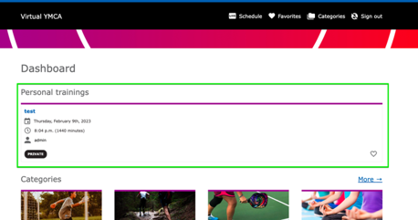
View a video of this process.
There are multiple ways to add a new video, depending on the type of site you’re working with:
Level (if applicable): Select a level for your video, such as for an on-demand class.
Instructor Name (if applicable): Type in the instructor’s name.
Category: Choose a category for your video by typing it in and selecting from the dropdown. Only one category can be assigned per video.
Equipment: If your video features the use of equipment (e.g., exercise equipment in a workout video), type the name of the equipment and select it from the list. To add multiple items, click “Add another item.”
Duration: Add your video’s length in seconds in the “Duration” field.
Featured Video: To feature your video on the Virtual Y homepage, click the “featured” checkbox.
Please follow these steps if you wish to customize the photo users will see when they log into the Virtual Y site.
To update the image before the user logs in:
Log into the site as a Site Owner.
Go to Manage > Content (click directly on Content, not one of its sub-menus).
In the content grid, find “Virtual YMCA Login” and click the Edit button for that row.
Expand the “Header Area”.
Click the Edit button next to the “Banner” row.

Expand the “Image” section. Locate the current image and click the Remove button underneath it (not the Edit button).

Re-expand the “Image” section and click the Select Images button.
If the desired image is not already in the system, click the Upload images link to add it.
If the image is already in the system, select it and click Select media.

Scroll to the bottom of the page and click Save.

If you also want to modify the image the user sees after they log in, repeat the steps above, but in step #3, find “Virtual YMCA” instead of “Virtual YMCA Login”.
Virtual Y uses Drupal’s Image Styles concept to allow you to upload a single image but display it in several ways. Image Styles automatically resize, crop, or otherwise manipulate images on display. This allows for consistent image presentation across the site, regardless of the original image dimensions. Because of this, there are no strict image dimensions required for images in your Virtual Y site.
We can, however, provide guidance on what images work best with the image styles used on the site:
When including images for “Meta” (preview) purposes, such as for social media sharing, images should be at least 1080px in width.
This module is distributed as part of the YCMA Virtual Experience Platform (Virtual Y). Review the openy_gc_livechat README for more technical information.
/admin/modules) and enable the Virtual Y Livechat (openy_gc_livechat) module./admin/openy/virtual-ymca/gc-livechat-settings). Review the settings and modify them if necessary./admin/people/roles/add) and add a role entitled Virtual Trainer if it does not exist.admin user will also need to have this role set.Visit any Live Stream event. At the time that the event starts, a Live Chat button will appear below the video.
All participants can enter the chat, set their name, and chat throughout the entire Live Stream event.
At any point during a chat session, users with the Virtual Trainer role have the ability to disable the chat using the Disable Chat button.
Users will see a message saying “Instructor disabled chat for users”.
Chat can be restarted using the Restart Livechat button on the event page, next to the chat icon.
Disabling chat will remove the history of that chat from the server.
/admin/openy/virtual-ymca/gc-livechat-settings)./admin/virtual-y/chats).If the chat button is not appearing, or the dialog displays “Chat is not available” or “Chat is not working at the moment,” you will need to check with your development partner to ensure the Livechat service is properly configured on your server.
Introduced in Virtual Y 0.7, the “Open Y Virtual YMCA Log” module generates logs to record user behavior on Virtual Y sites. This module is part of the Open Y distribution and helps track user activity for reporting and analysis.
To enable the module, visit the Extend page on your site (/admin/modules), or ask your partner for assistance. You will need appropriate administrative permissions to access the Extend page.
Once the Log module is enabled, you’ll see two new items in the Virtual Y menu (/admin/config/virtual-ymca):

The Virtual Y Logs page (/admin/config/virtual-ymca/logs) displays searchable and filterable individual user activity. Additionally, individual log items can be removed. This allows administrators to review and manage user activity data directly within the Drupal interface.
Activities that are currently being tracked include:
The Open Y team is working to add additional logging functionality as they gather requirements. If you have additional logging requirements for your reporting, please contact the YMCA Website Services team with as much detail about your requirements as possible. Providing detailed use cases helps the team prioritize and implement relevant logging features.
As of
Virtual Y 1.1, log archives can be generated on-demand via Virtual Y > Logs > Export Log Records (/admin/config/virtual-ymca/logs/export).
While logging begins immediately, log archives (prior to VY 1.1) should appear on the first day of the month following when logging is enabled. Log archives will be available as .gz files. The archive stores data indefinitely, but the log itself then deletes out the previous month’s info out of the database to start collecting data for the current month. This ensures efficient storage and data management.
virtual-y-logs-2021-01.csv.gzThe log archive process depends on Drupal’s cron task, so you’ll need to ensure that cron is running periodically on your site. The cron task is responsible for automatically generating and archiving the log files. You can configure cron jobs through your hosting provider or using Drupal modules like
Automated Cron.
To extract .gz files:
.gz file is located, then run gunzip my_log_file.csv.gz. Replace my_log_file.csv.gz with the actual name of your archive file..gz file..csv file with Excel or Google Sheets.Your Virtual Y log archives may include times in the created column that look like 1606839555. This is a format called “Unix epoch time”, representing the number of seconds that have elapsed since January 1, 1970 (midnight UTC/GMT). You can convert it to a human-readable format in a few ways:
= (A1/86400) + DATE(1970,1,1), substituting the correct cell for A1. This formula divides the Unix timestamp by the number of seconds in a day (86400) and adds it to the base date of January 1, 1970.Your standalone Virtual Y site may have a block with social media links at the bottom of the page. These links can be customized for many social media services.
Your site may have a “Quick Edit” icon (a tiny pencil) that appears when you hover over the section with the links. If so, click the pencil, then Edit.

OR
If you don’t see the Quick Edit option, you can navigate to the Block editor via the admin menu at Structure > Block Layout > Custom Block Library > Edit Footer Social Block.

In the Block editor, you will see a Content field containing links to your social media sites.

Select the text you want to link, or double-click an existing link to modify it.
In the URL field, add the complete URL to the social media site.
Edit the Title field to something more descriptive; this will be used as the title attribute for accessibility.
Open the Advanced section and update the CSS classes field to select the correct icon. Be sure to copy the entire code snippet below for the icon you want. These CSS classes use Font Awesome icons.
fa fa-facebookfa fa-twitterfa fa-youtubefa fa-instagramfa fa-vimeoNote: The available icons may depend on the version of Font Awesome included with your site theme.

When you are finished, click Save.
Requirements | Getting Started | Fetching Shared Content | Publishing Shared Content | FAQ
Released in 0.12, Virtual Y’s Shared Content module allows Y’s to share their content with other associations/branches and to pull shared content to use on their own site.
To start sharing content, you need to get your site ready.
On the Drupal Extend page (/admin/modules), enable Virtual Y Shared Content. If your site is hosted on a managed hosting environment, this step is either already done for you or will need to be done by your hosting partner.

Accept any other required modules if asked.
In order to share content, you’ll first need to register your site with the Open Y shared content server:
/admin/virtual-y/shared-content/server)▾) under Operations then Edit
On the following page, simply Save the form. Once you’ve saved the form and your site is able to contact the server, the Source Token will be populated.

New connection requests are reviewed periodically and are approved by the Open Y team to prevent abuse. Please allow up to two business days for approval, or email ycloud@ymca.net with the URL of your site to request approval.
Once you are connected to the server you may, at any point, Fetch content from the server:
/admin/virtual-y/shared-content/server)Your site will fetch Virtual Y blog posts and Virtual Y Videos from the server. In each list you may:

As of Virtual Y 1.6.1 (released in December 2021) the fetched content list will show items in different states:
Also in VY 1.6.1, content can be fetched directly from the preview.

You can share your own content to other Y’s in the Movement too!

/admin/content) then:New connection requests are reviewed periodically and are approved by the Open Y team to prevent abuse. Please allow up to two business days for approval, or email ycloud@ymca.net with the URL of your site to request approval.
If your site is in a “pre-live” mode and is somehow restricted from being publicly accessible (sometimes called “Site Lock” or “HTTP Auth”) you will not be able to share content. Please wait until your site is live to share content.
Tech stack required:
Recommended Hosting Solutions:
A security certificate authenticates that you own your website and displays a lock icon in the user’s web browser. Most modern browsers require SSL certificates. SSLs are widely available from a large number of reputable providers.
Only required for standalone Y sites. Can be set up with its own unique web address (i.e., virtualymcatn.org), a unique directory within your existing site (ymcamidtn.org/virtual) or as a subdomain of your existing site (virtual.ymcamidtn.org).
Requirements for each of these setups are unique. Contact your developer partner or the Open Y community for help with your setup.
CRMs with Full Integration:
Other CRMs:
User segmentation is a feature within Virtual Y that allows you to categorize your users. This enables you to:
In your Drupal toolbar, hover over Virtual Y and click Virtual YMCA Settings.
Click the AUTH Settings tab. A list of authentication method options appears. If your desired authentication method isn’t listed, install it from the Extend menu.

Click Edit on the authentication method you want to use. User segmentation settings are located in the Permissions Mapping field at the top of the page.
In the membership field, carefully type or paste the name of a membership type from your CRM that you want to grant access to Virtual Y. Then, use the dropdown to select the appropriate access level for users with that membership type.

To add more membership types, click the Add one more button until all desired membership types are listed.
To remove a membership type: Delete the membership name from the field and select None as the Virtual Y role. Then, scroll to the bottom of the page and click the blue Save button. The empty line should then disappear from your mapping list.
You might need to add roles beyond the default three included in Virtual Y. While you can, keeping the number of roles to five or fewer is recommended, as managing content and avoiding fragmentation becomes more difficult with more roles.
If you’re unfamiliar with Drupal roles, consult with your agency partner for help customizing your Virtual Y roles.
Click People in the Drupal toolbar.
Select the Roles tab.

Click the blue Add Role button.
Enter the name of your new role in the field.

Note: The Machine Name for your role must begin with virtual_y_, or it won’t be included in the permissions mapping table. To ensure this, either name your official role “Virtual Y [Desired Role Name]” or click the small Edit button link next to the Machine Name and edit the text.

To add new content:
Select the Content tab in the administration toolbar at the top of the page.

Click the Add New Content button.
On the next page, select the type of content you want to add. Learn About Content Types ⇒
Click the Save button.
You can find content to edit in two ways:
Front-end: Navigate to the page on your live site (what your users see). If you’re logged in and have edit permissions, you’ll see the following tabs:

Click the Edit tab to edit the content.
Content administration page:
Select Content in the administration toolbar. This opens the Content administration page.
Use the text field on the left to search by title.
To narrow your results, filter by:

You can delete content in these ways:
You can also delete content in bulk:
On the Content administration page, select the checkboxes next to the content you want to delete.
Select Delete content from the dropdown menu above the results table.
Click Apply to Selected Items.
Warning: This action is irreversible. Be sure you’re deleting the correct content.
Each content type has different fields, but they generally fall into these categories:
These are single-line text boxes, such as page titles. Simply enter text into the box.

A larger box that allows line breaks, paragraphs, and longer amounts of text.
Select one of the available options. You might need to click a button to apply or submit your selection.

Similar to a dropdown, but you can select multiple options by holding Control (Windows) or Command (Mac) and clicking the selections.
A text editor that styles your text visually and allows you to add links and embed different types of media.
A text field with a circle on the right that’s used for searching content, blocks, or taxonomy terms.

These typically appear as a single box with two fields inside and add a link onto a page, often as a button:

The URL field supports relative URLs for links on your site (e.g., /join for http://myymca.org/join) and full URLs for links on other sites (e.g., http://someotherymca.org/join). You can also search for content by title and select it, like in other autocomplete fields.
Some link fields contain an Attributes section that you can expand to add attributes to your link:
ID: Identifies the link in the page’s HTML and can be targeted by anchor links. More on anchor/jump links.
Target: Determines how the link opens:
_blank: Opens the link in a new tab or window._self: Opens the link in the same tab or window.Class: Applies a CSS class to the link for styling.
You can add, edit, and upload images any time you see a tab with “Image” in the title. To use the media browser, click the button in the image field.
More on Using the Image Library ⇒
You can clone content using the Clone button on many pages:

or on the Content list in the site administration:

After selecting Clone, you’ll see a screen asking which entities you want to clone. Generally, you can leave the checkboxes as they are, as changing the options could cause unintended consequences.

At the bottom of the options, select Take ownership if you want your user account to own the new content, then click Save.
Two sets of demo content are available for the distribution:
These modules also contain significant boilerplate migration code that a developer would need to migrate content from an older Drupal site or different CMS into the distribution.
Demo content is also installed on the Sandboxes.
The distribution offers a couple of ways to present membership options to visitors and direct them to the appropriate membership management system (MMS) for signup.
The two primary methods for informing visitors about membership options involve:
Every membership management system will have different ways of linking for members to complete their registration. Here are a few we know about. If you have tips for an MMS not listed here, feel free to leave them in the comments.
Navigate to: Membership > Membership Types > Edit > Online Settings. This provides the deep link to the specific membership types.

The Membership Calculator is bundled with the distribution in the
openy_calc module.
As of August 2024, the Membership Calculator has an updated design with improved functionality and user experience. The improved design also responds to the selected colorway and page styles.
The Membership Calculator uses Membership content items. These must be created for the Membership Calculator to function.
Create a Membership node for each membership type your Branch or Association offers.
Inside each Membership node, add a Membership Info Paragraph with the details of that membership at each of your Locations. This paragraph includes fields for:
The Membership Calculator presents a three-step process:
This step displays the Title, Image, and Description of each published Membership node. This information is pulled directly from the corresponding Membership content items.
This step shows a map with radio buttons, enabling members to select their preferred primary location. All locations listed in the YMCA Website Services Location Filter Settings (see the Troubleshooting section below) are included in the list.
This final page displays a link for members to continue their registration or a message stating that the selected membership is unavailable at the chosen location. The summary includes:
Once configured, the Membership Calculator can be placed on a page using:
If the second step of the Membership Calculator does not display any locations, navigate to Administration > YMCA Website Services > Settings > YMCA Website Services Location Filter Settings. Ensure that all Branches you want to include in the location search are selected.
The Membership Framework is distributed in the
openy_memberships repository and must be
added and installed on top of the base distribution. We recommend working with your development partner if you wish to go this route.
Check out the Membership Framework sandboxes for a demonstration.
To get started with the Membership Framework, you will first need to create a number of landing pages.
The examples below use Paragraphs. Similar pages can be created using Layout Builder blocks and the Membership Framework custom block.
Go to /node/add/landing_page
Title: Membership Builder
Layout: Two Columns with left sidebar
Header Area: Add a “Small banner” paragraph and fill in the fields.
Content area: Add a “Memberships” paragraph (it has pre-filled fields).
Sidebar Area: Add a “Block Container” paragraph with the “Memberships Desktop Sidebar” skin.
Sidebar Area: Add “Simple content” with the “Memberships Button” skin and link to the builder:
<p><a class="btn btn-primary" href="/membership-builder"><span class="text">JOIN THE Y</span></a></p>
Sidebar Area: Add a “Sidebar Menu” with the “Memberships Sidebar Menu” skin to create your Memberships Menu with these items:
Sidebar Area: Add a “Block container” with the “Memberships Feature card” skin. Use the “Feature Card” block type with any content allowed in this block.
Save the landing page.
/node/add/landing_pageGo to /node/add/landing_page
Title: Member Benefits
Layout: Two Columns with left sidebar
Header Area: Add a “Small banner” paragraph and fill in the fields.
Content Area: Fill the area with content. An example is shown in the next screenshot.
Sidebar Area: Follow the same steps for the “Membership Builder” page.
Save the landing page.
Go to /node/add/landing_page
Title: Discounts
Layout: Two Columns with left sidebar
Header Area: Add a “Small banner” paragraph and fill in the fields.
Content Area: Fill the area with content. An example is shown in the next screenshot.
Sidebar Area: Follow the same steps for the “Membership Builder” page.
Save the landing page.
Go to /node/add/landing_page
Title: Corporate Wellness
Layout: Two Columns with left sidebar
Header Area: Add a “Small banner” paragraph and fill in the fields.
Content Area: Fill the area with content. An example is shown in the next screenshot.
Sidebar Area: Follow the same steps for the “Membership Builder” page.
Save the landing page.
/node/add/landing_pageGo to /admin/commerce/products
Click on + Add product, then choose Membership.
You’ll see these fields:
Subfields:
Branches in the product: Use if a membership is specific to a branch. If “None” is selected, the membership will appear for all branches.
A typical setup is shown in the following screenshot:
Click on the “Save and add variations” button (or go to the “Variations” tab if editing a previously created product).
A typical setup for variations of a membership is shown in the following screenshot:
Under the hood, these applications use the Activity/Class/Session Content Types and the YMCA Sync module to import content from an external API. These components together comprise the “Program Event Framework,” which is highlighted in a case study on drupal.org.
Activity Finder combines data from the Activity, Class, and Session content types into an interactive tool that can be used with Paragraphs or Layout Builder pages.
Out-of-the-box, YMCA Website Services’s Activity Finder integrates with Daxko, ActiveNet, and Personify. Configuring these integrations is mostly user-friendly, but often is supported by a partner development team. Any other CRM will require custom developer work.
See the Program Event Framework developer docs for a full list of integrations.
When you add the Activity Finder block to a page, you have a number of options. These are in addition to the configuration at Admin > YMCA Website Services > Settings > Activity Finder Settings (/admin/openy/settings/activity-finder). See
the Activity Finder module README for more information.
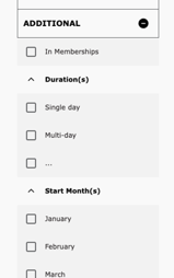
/admin/openy/settings/activity-finder) and defaults to:Once the Activity Finder Paragraph or Activity Finder Layout Builder Block has been added to a page, users can see its content.
/admin/openy/settings/activity-finder).See Block Configuration for more detail on other available filters.
The filtered results in the Activity Finder app are a list of Sessions that meet the given filter criteria.
Each row of results contains:
Clicking on the row will bring up a pop-up with further details:
UTM codes can be used to track the effectiveness of marketing campaigns. Activity Finder uses query strings as filters, but as of version 4.2.0 it will also maintain UTM codes in the URL.
Activity Finder begins with a number of preset arguments, and those can be modified at Admin > YMCA Website Services > Settings > Activity Finder Settings (/admin/openy/settings/activity-finder) in the Allowed Query Arguments field.
Once those settings are saved, you can visit an Activity Finder page with UTM codes attached, for example:
https://example.com/activity_finder?step=results&selectedAges=24&selectedLocations=1541437&selectedActivities=2786027,2786083&utm_source=promotional_member&utm_medium=email&utm_content=button_register_now&utm_campaign=fall_group_swim_lessons_2021
and see that the codes are maintained as the filters are changed.
Sometimes called “Group Exercise” or “Group Schedules”, the Repeat Schedules block provides a similar view to Activity Finder, but focuses on recurring, often drop-in classes. You can see an example of this on our sandbox site.
Developers can find more information in
ynorth-project/openy_repeat and
Program Event Framework.
As of August 2024, the Schedules have an updated design with improved functionality and user experience. The improved design will also respond to the selected colorway and page styles.
openy_repeat
2.2.0 and above via the Repeat (Group) Schedules (lb_repeat_schedules) module.After you add the Paragraph or Block to a page, configure the options:
Data from Sessions, Classes, and Activities are all used to form the Repeat Schedules. Here’s what shows up where. Fields are noted with their relationships, so session.class.activity.title means “the title of the Activity referenced by the Class referenced by the Session”.
Fields used in the table view:
Fields used in the popup view:
See PEF Schedules for installation instructions. Also reference the README.md file in the module for additional information.
Once you install the PEF Schedules module, you will be able to build schedules and add sessions via a calendar-based builder.
The Schedule editor allows Content Editors to create Sessions on a WYSIWYG calendar interface. As described in the PEF data model, Sessions require Classes, which reference Activities, which reference Program Subcategories, which require Programs.
flowchart LR
    subgraph "PEF Relationships"
        direction LR
        Session -- requires --> Class
        Class -- references --> Activity
        Activity -- references --> PS
        PS -- requires --> Program
        PS["Program Subcategory"]
    end
You will need to create at least a Class and Activity to start adding events to the calendar. Go to Admin > Content > Add Content (/node/add) to start adding items.
If you have preexisting content for any of these content types you can use them here. You may first need to configure the Activity Color for existing Activities.
PEF Schedules adds a new Color field to Activities which is used to style the categories on the calendar.
The Color field takes a hex value (#XXXXXX where X is a hexadecimal character (0-9, a-f)). We recommend using colors from the
Brand Standard Color Wheel. The default color is configurable in the Calendar Settings. We recommend selecting dark tones from the color wheel as the item titles are displayed with white text.
Settings for the calendar are configurable at Admin > YMCA Website Services > Settings > Schedules calendar settings (admin/openy/settings/schedules-calendar). This form is managed by the \Drupal\y_pef_schedule\Form\FullCalendarSettingsForm.
Options include:
00:30:00 for 30 minutes). Must be in the format of HH:MM:SS.00:30:00 for 30 minutes). Must be in the format of HH:MM:SS.01:00 for every hour). Must be in the format of HH:MM.HH:MM:SS format that you want to be visible in the calendar’s view. This setting helps to limit the view to specific hours, making the calendar more relevant to the user’s needs.HH:MM:SS format that you want to be visible in the calendar’s view. This time represents the cutoff point at which the calendar view will stop displaying events for the day.#XXXXXX where X is a hexadecimal character (0-9, a-f).Once everything is configured, you can start managing schedules. See a list of available schedules at Admin >
Content > Schedules Calendar (admin/openy/branch-schedules). Click on one of the options to open the editable schedule.
When in the schedule, you can:
When creating a session from the schedule, you’ll see a simplified version of the Add Session (/node/add/session) form.
Once content is added to the schedule, you have several options for showing it to users: